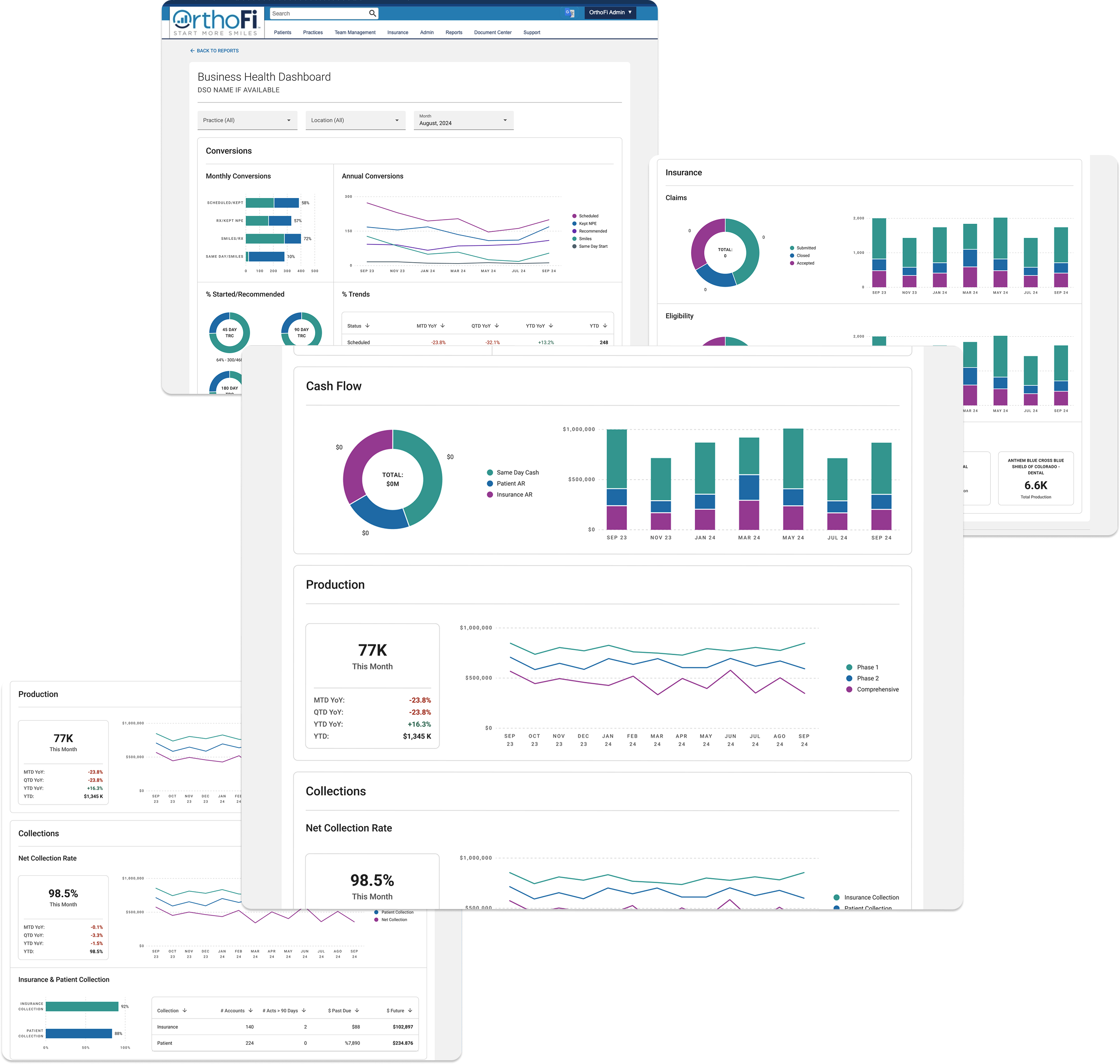
Overview
OrthoFi is a healthcare SaaS platform that helps orthodontic practices manage insurance, billing, and patient onboarding. As part of a company-wide shift from Tableau to Power BI, the internal Business Intelligence (BI) dashboards needed a complete redesign.
This initiative focused on revamping three core dashboards used daily by account teams to evaluate insurance aging, claims status, and overall financial health. The original dashboards were inconsistent, visually dense, and difficult to act on.
The Objective:
Redesign key Power BI reports to streamline workflows, improve visual clarity, and support monthly client performance reviews.
My Role:
UX Designer — Data Visualization, Dashboard Architecture, Prototyping, Layout Systemization
Tools: Figma, Power BI, Excel
Team:
Product Manager, Product Owner
Engineering Manager (technical lead)
Developer (Power BI specialist)
Internal stakeholders (Account Managers, Finance)
Subject Matter Expert
Design Strategy
Design Challenge:
Power BI, while powerful, has layout constraints and limited customization. The key was to design within those boundaries while improving readability, hierarchy, and modularity.
Design Goals:
Prioritize top KPIs for at-a-glance comprehension
Group related metrics visually using clear spacing and labels
Use chart types purposefully: line for trend, pie for breakdown, table for detail
Apply scalable, reusable patterns across all dashboards
Redesigns
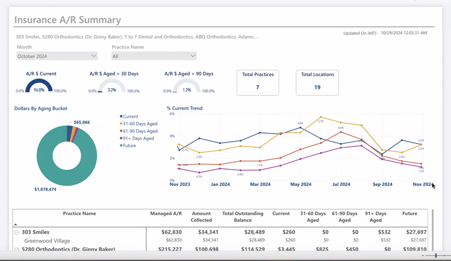
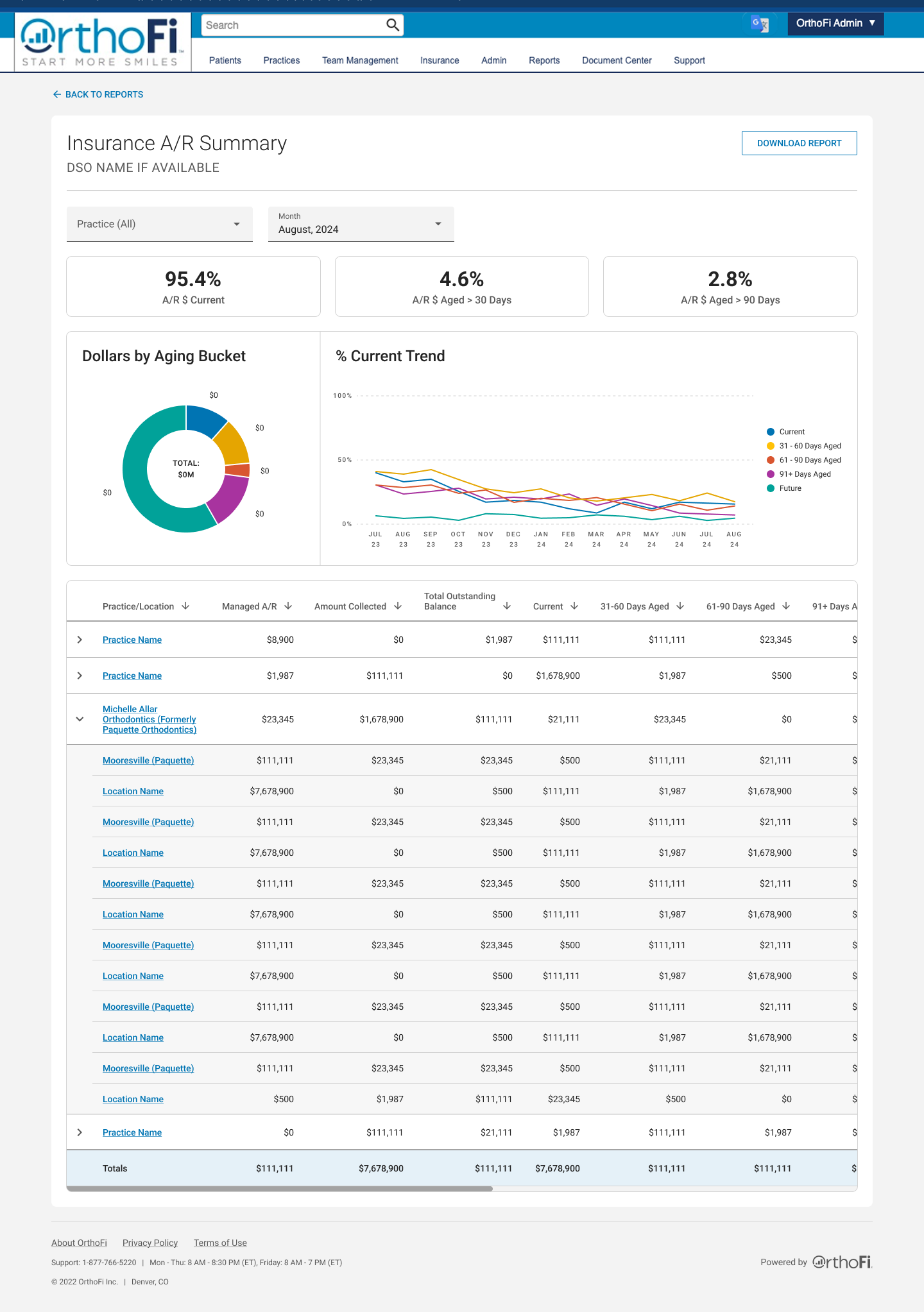
Insurance A/R Summary
Problem: Account managers struggled to interpret aging receivables across multiple practices. KPI metrics were buried below visualizations, and filters were inconsistent.
Solution:
Introduced a persistent KPI bar (Current %, >30, >90)
Used a pie chart to visualize dollar distribution by aging bucket
Added a line graph to show trends over time
Reordered the layout to follow natural decision flow: filter → scan → dive deep
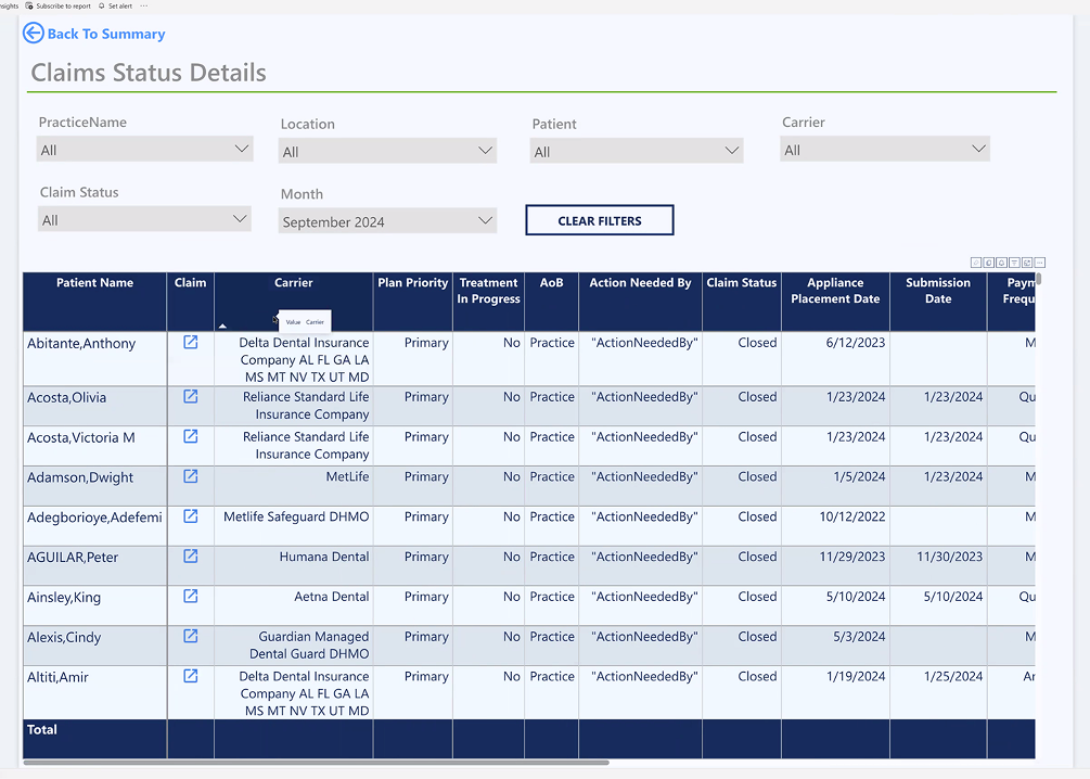
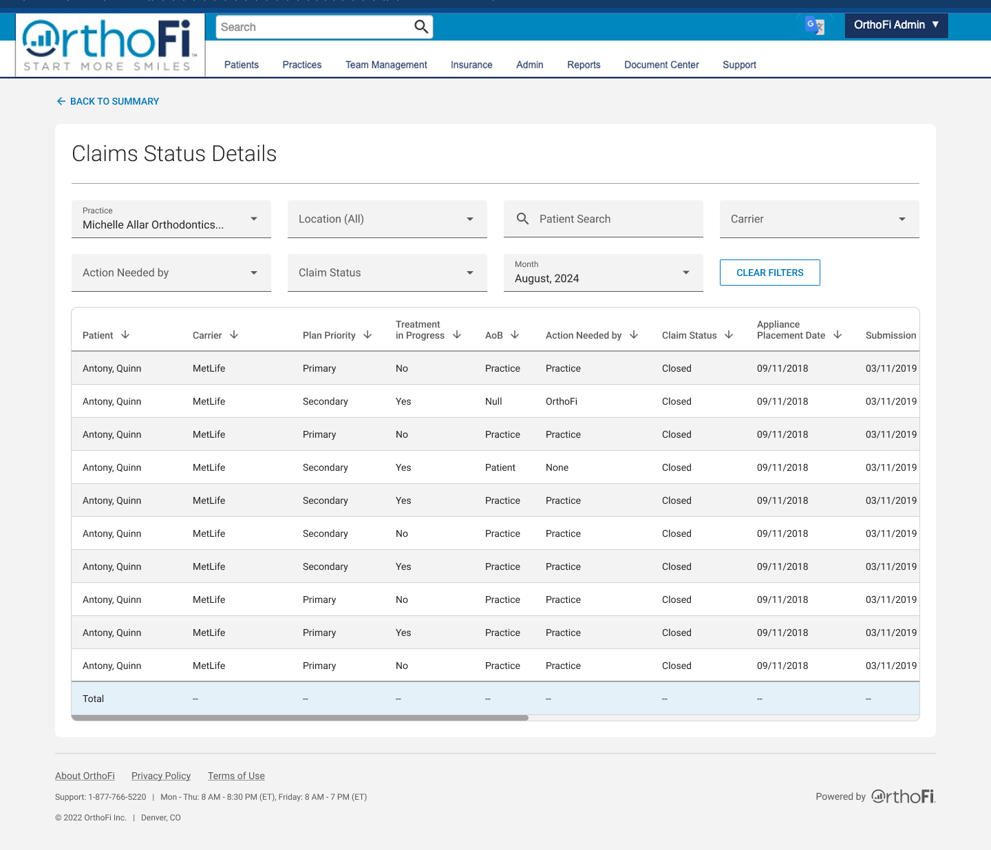
Claims Status Summary + Detail
Problem: Users couldn’t quickly identify which claims needed action and by whom. Overlapping filters and an inconsistent table made tasks slower.
Solution:
Simplified and grouped filter logic by status and role
Used bar/pie charts to highlight claim statuses and ownership
Created sticky headers and sortable tables to reduce friction
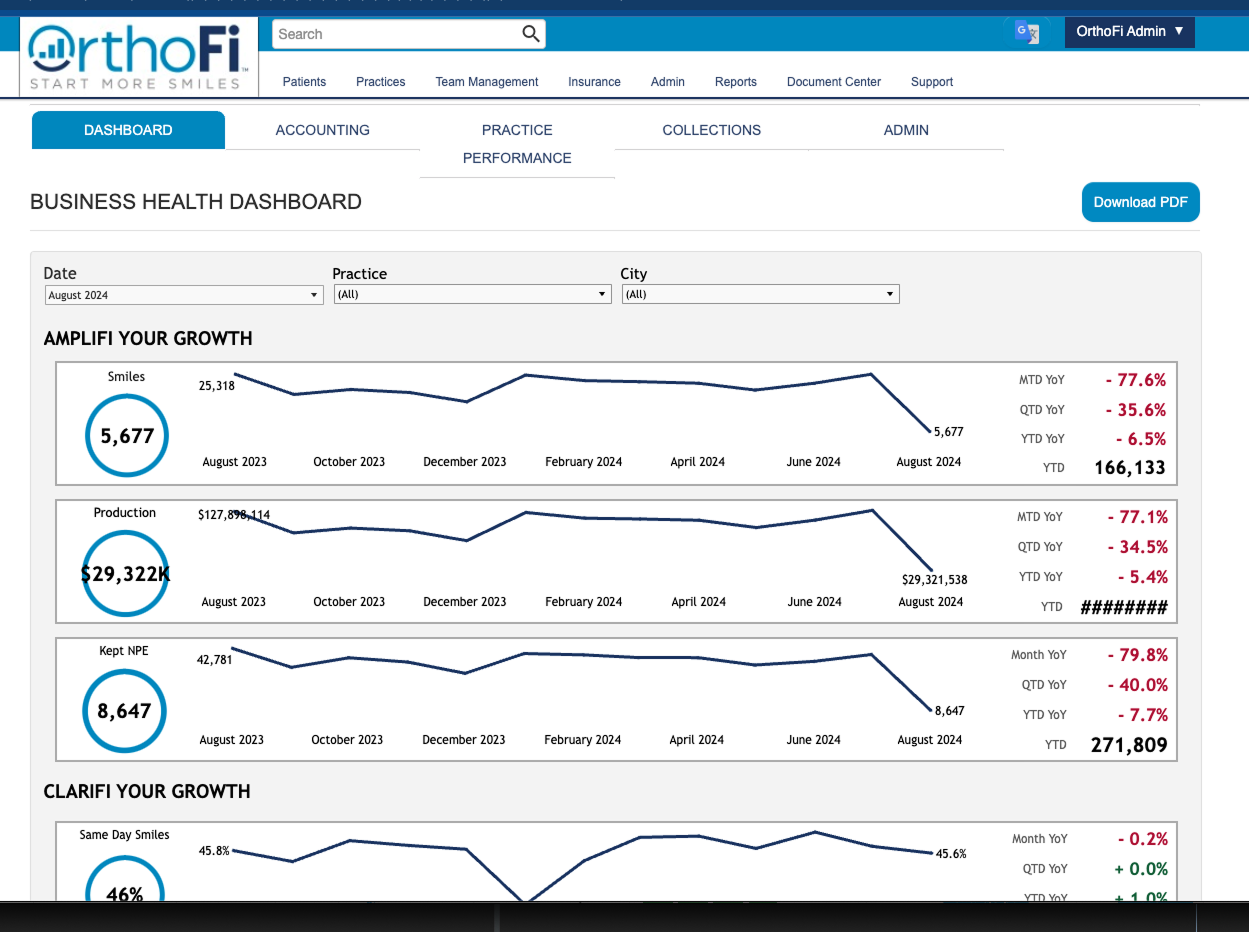
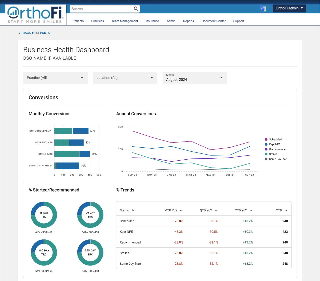
Business Health Dashboard
Problem: This high-density dashboard tracked everything from conversions to carrier claims—but lacked clear groupings or flow. New users felt overwhelmed.
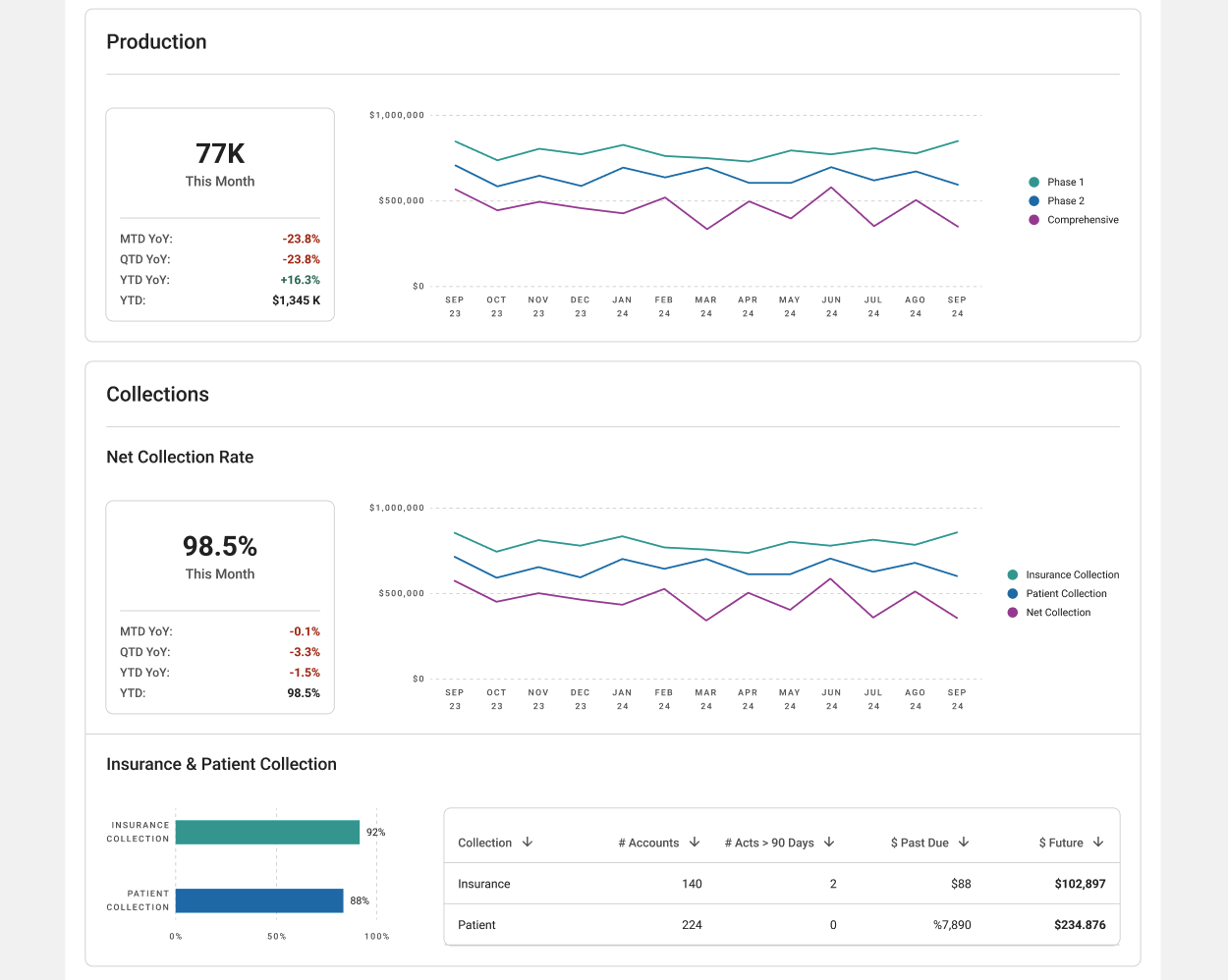
Solution:
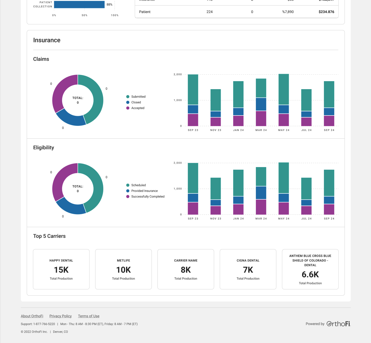
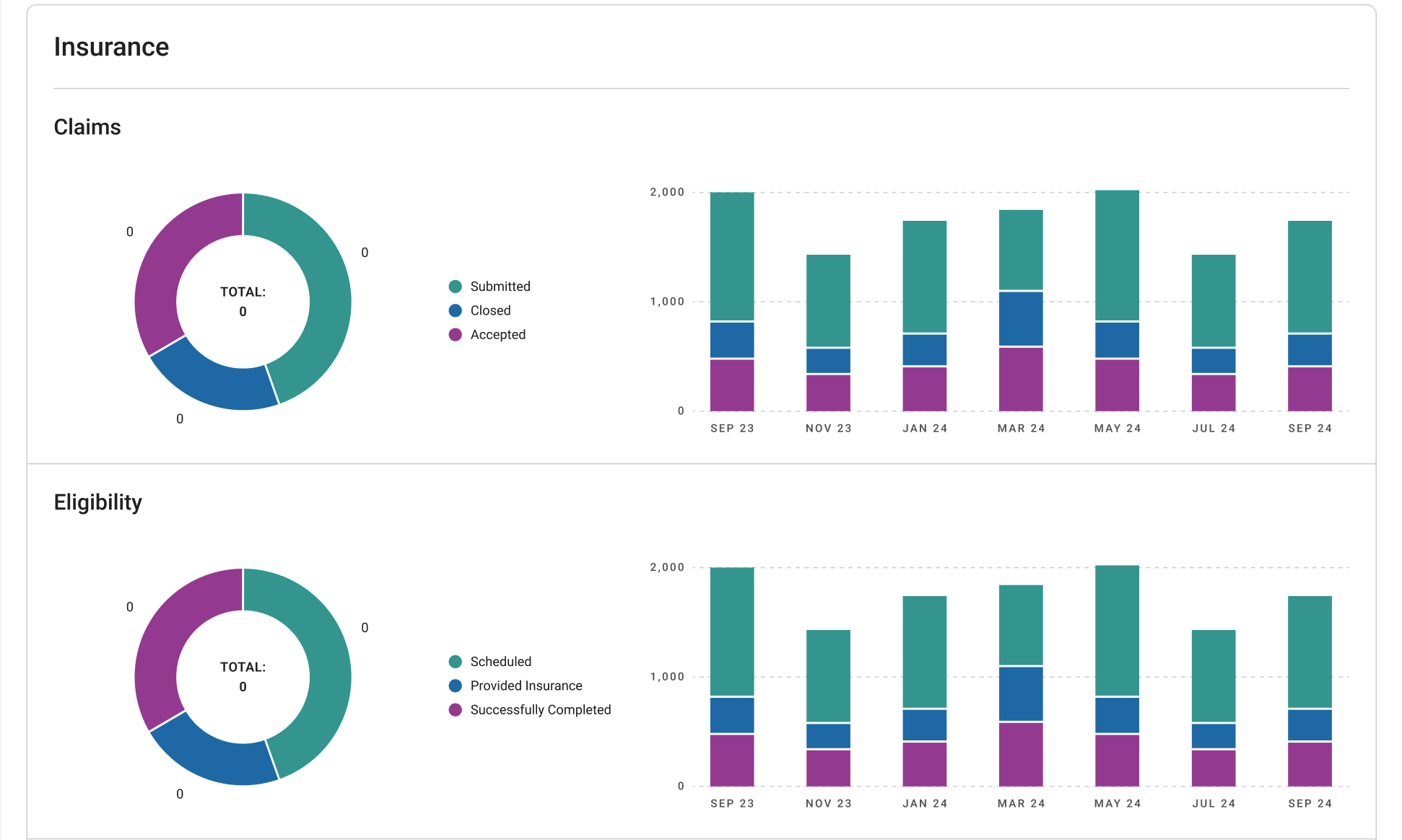
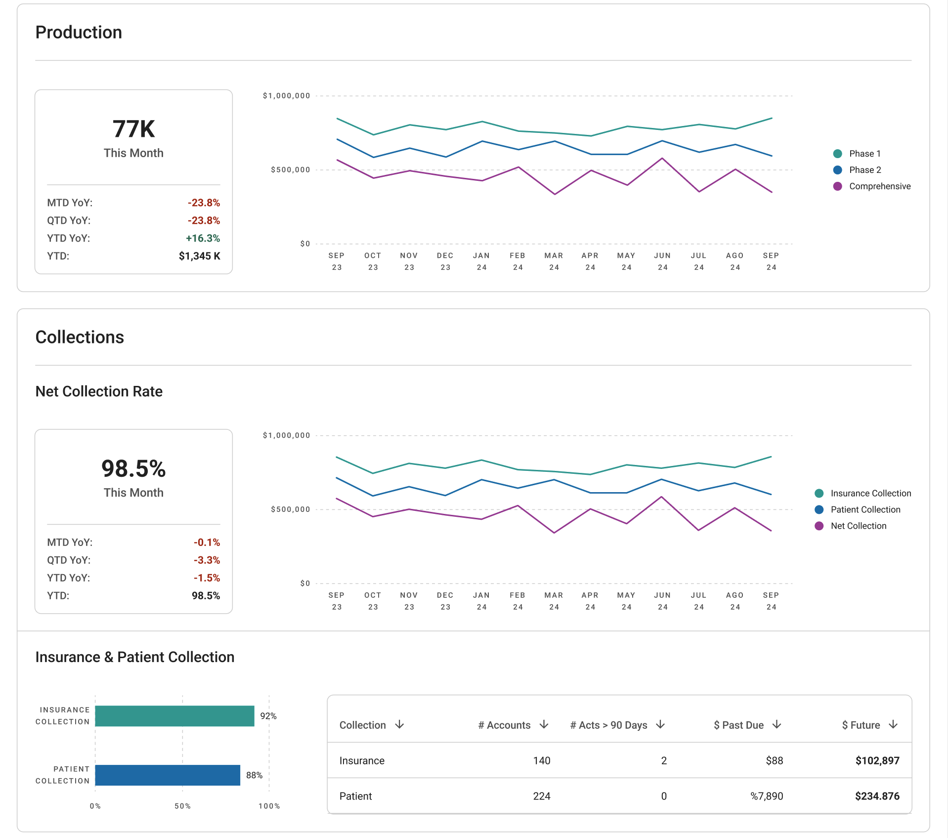
Grouped sections by business function (Conversions, Cash Flow, Collections, Insurance)
Applied consistent chart types and spacing rules
Standardized KPIs into reusable card templates
Results
These redesigned dashboards are now core to how OrthoFi's account teams evaluate financial performance. The visual clarity and modular structure have made the tools easier to use, faster to interpret, and more scalable across the business.
Cut onboarding time for new team members by simplifying information architecture
Made monthly reporting reviews quicker and more actionable
Created design patterns now reused in other Power BI reports
Influenced internal standards for how financial data is presented company-wide
What I Learned
This project deepened my ability to think systematically, not just about layout, but about how design choices shape behavior over time. I learned how to work within highly technical platforms, advocate for clarity in the face of complexity, and prioritize design decisions that serve real workflows under pressure.
Clarity often comes more from layout rhythm and hierarchy than aesthetics
Scalable UX requires reusable thinking, not just reusable components
Even with rigid tools, you can build thoughtful, human-first interfaces when you know your user