iMaxX
Optimizing revenue through smarter billing logic

Role
PRODUCT DESIGN
Year
2024
OVERVIEW
OrthoFi needed to transform complex insurance rules into a seamless, scalable, trusted part of its platform. iMaxX became that solution — turning manual, error-prone processes into an efficient, user-friendly workflow for internal teams and Treatment Coordinators (TCs).
I led product design end-to-end, balancing modern design patterns with legacy system constraints, driving collaboration across product, ops, engineering, and users to deliver a solution that rebuilt trust and became a flagship feature.
-
Insurance billing workflows at OrthoFi were fragmented and inefficient.
Internal operations teams managed hundreds of rules manually, with no scalable tooling and heavy reliance on engineering for updates — a bottleneck that slowed onboarding and reduced agility.At the same time, Treatment Coordinators had to navigate this complexity live with patients. The UI felt detached from their fast-paced workflow: modal windows, unclear guidance, and an experience that risked billing errors and eroded confidence.
-
We recognized that solving this wasn’t about building a “rules engine” — it was about designing an experience that surfaced the right logic at the right time, without friction.
This was a chance to:
Enable scalable rule management directly by operations teams
Reduce the burden on TCs by embedding logic seamlessly into their workflow
Improve billing accuracy, increase trust in the system, and drive measurable business impact
-
The vision was clear:
Create a system that empowers both internal teams and TCs by delivering a faster, smarter, more trustworthy billing experience.Key objectives:
Provide operations teams with reusable, scalable tooling to manage carrier-specific logic independently
Seamlessly integrate insurance-backed guidance into TCs’ fast-paced workflows
Minimize cognitive load while improving clarity and accuracy
Reduce support requests, improve onboarding speed, and increase production

Process
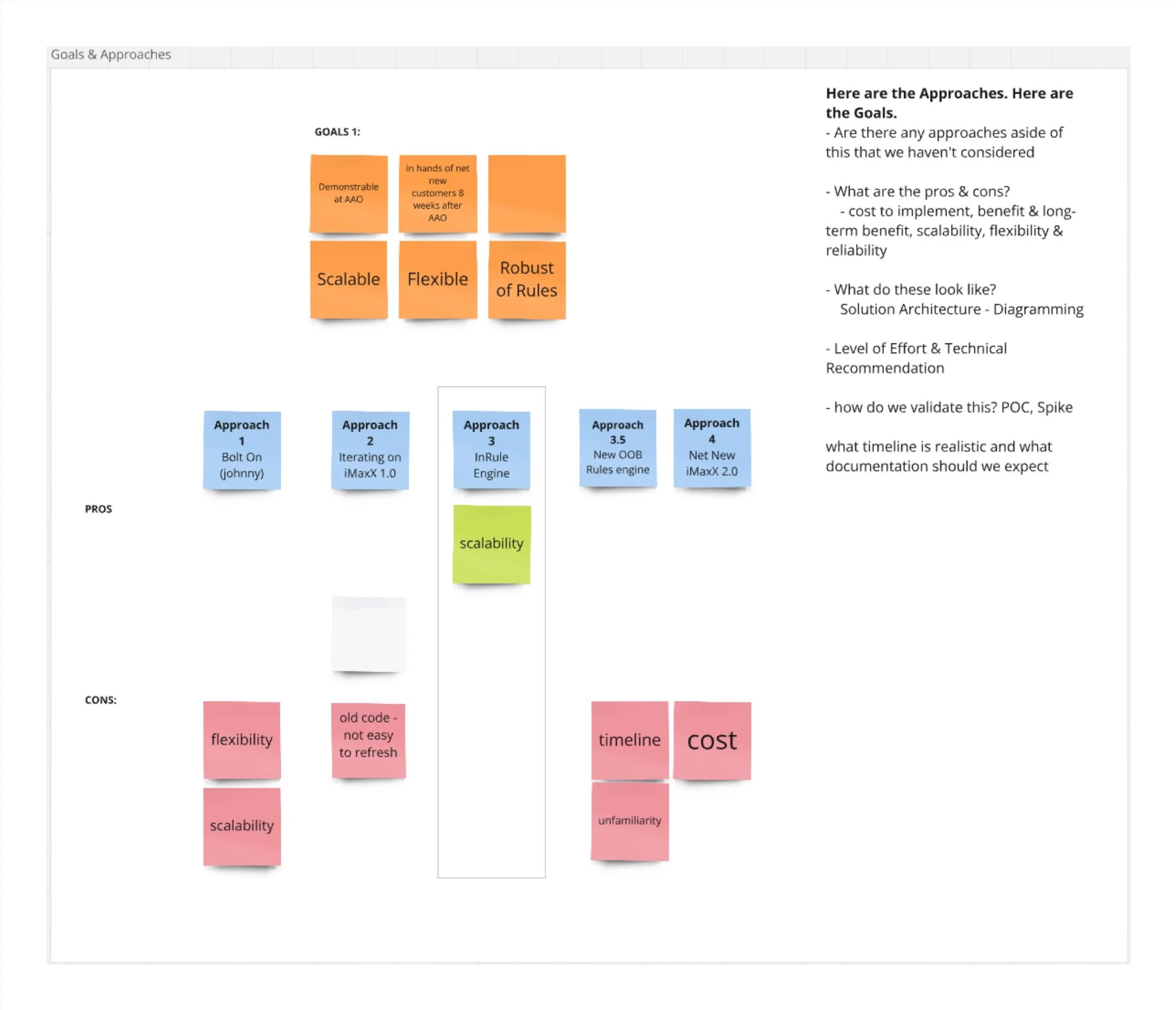
Discovery & Framing
At the core of this challenge was a sequencing dependency: before we could improve the Treatment Coordinator workflow, we needed to give OrthoFi’s internal operations team the ability to efficiently configure and manage insurance rules across hundreds of practices.
This meant tackling two tightly connected but distinct design problems:
1. Internal tooling for scalable carrier rules management
2 An intuitive, real-time UI for TCs to use at the point of care
We reframed the goal as a systems design challenge:
“Design a foundation where the right billing logic can surface at the right moment — reliably, quickly, and with minimal friction for all users.”
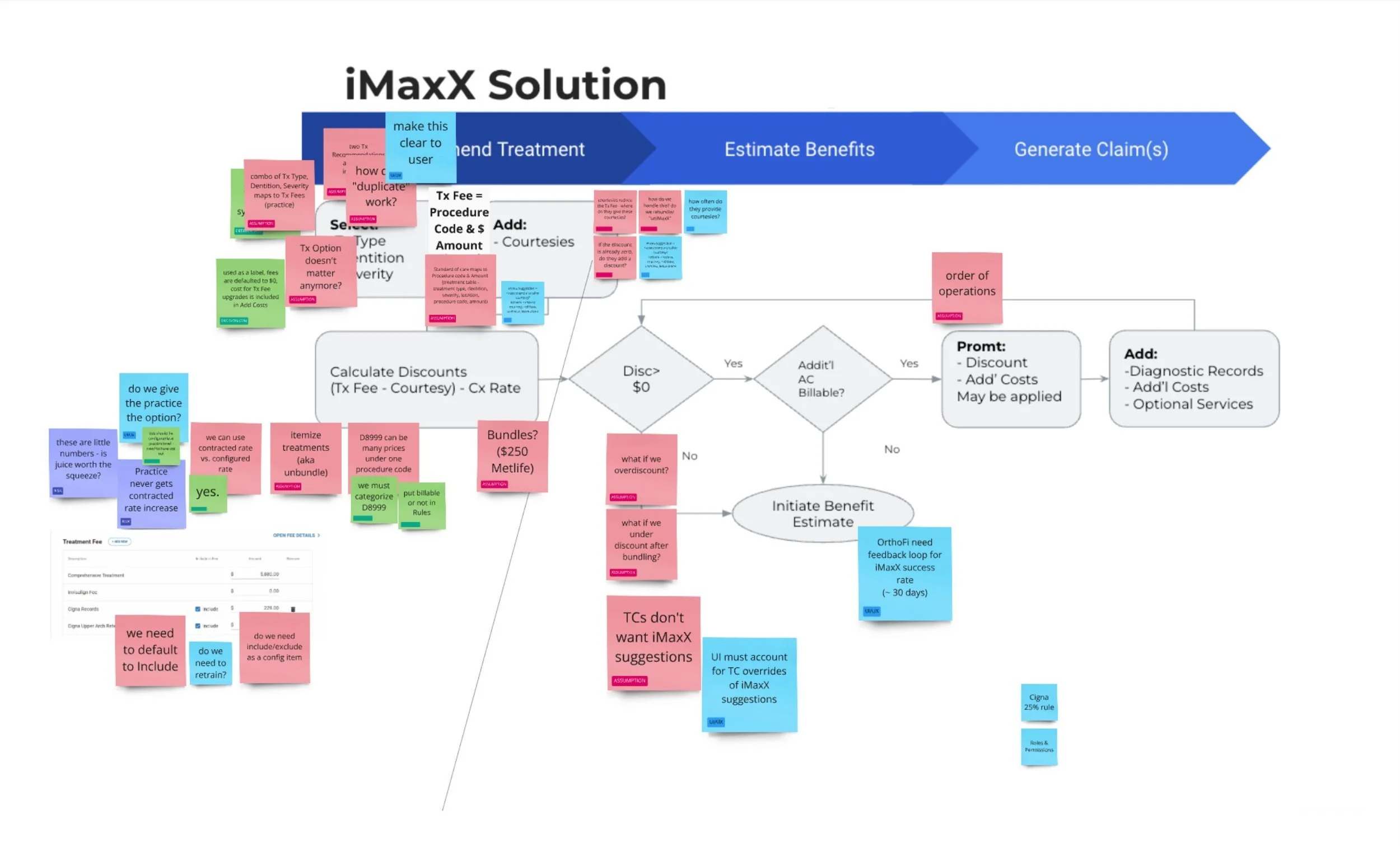
Design Strategy
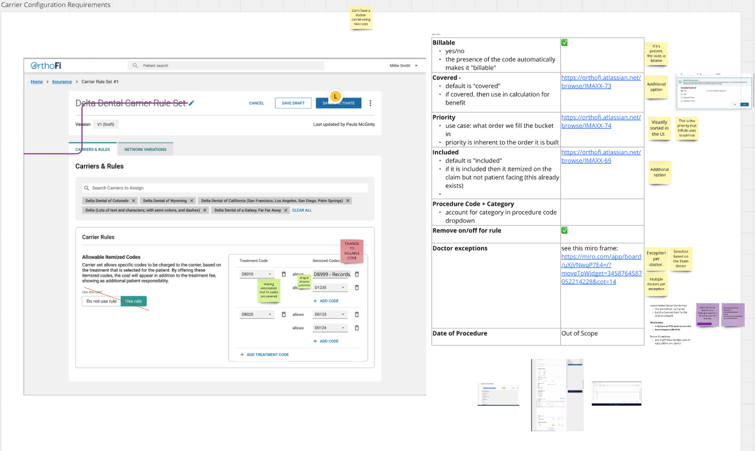
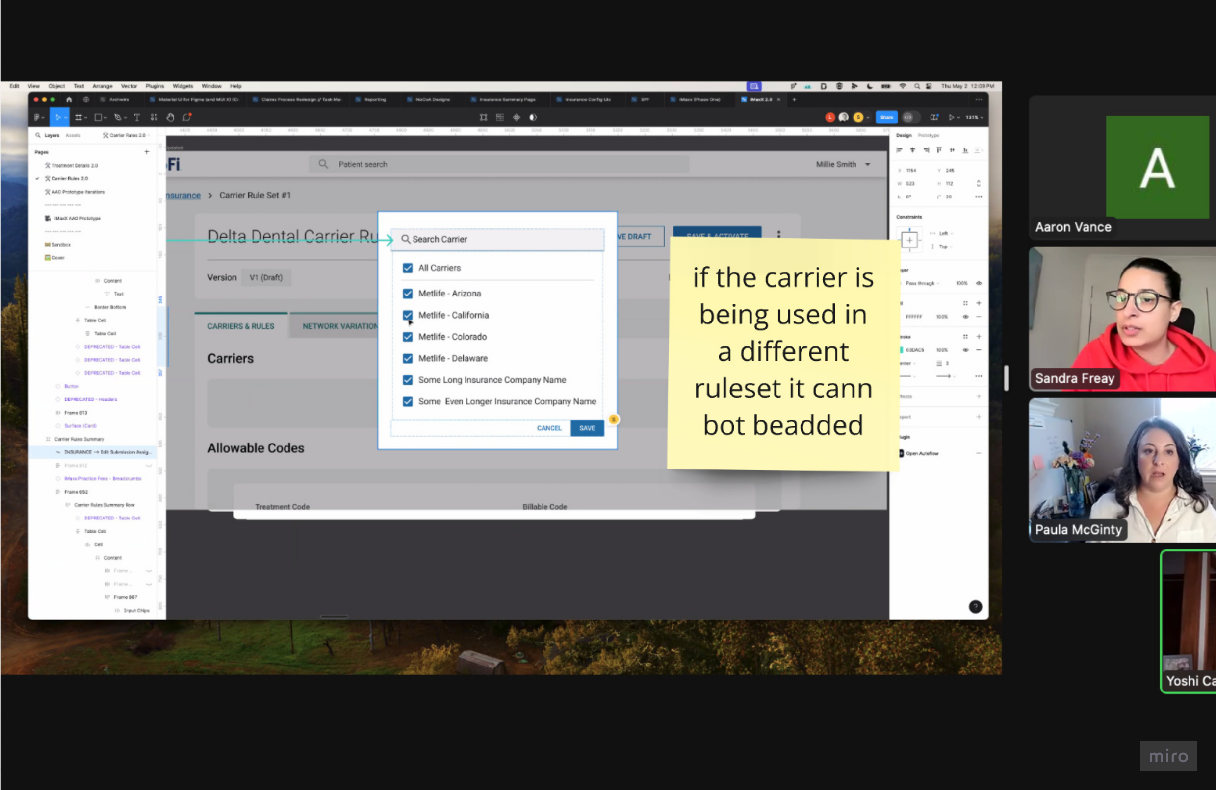
Phase 1: Internal Carrier Rules Configuration
The legacy internal process was highly manual: each rule was entered individually, no reuse or copying was possible, and engineers were needed for every change, slowing onboarding and preventing scale.
I designed a scalable, user-centered configuration tool that empowered ops teams to manage rules independently:
Reusable, copyable rulesets for quick replication across carriers, doctors, and locations
Drag-and-drop ordering for control and prioritization of codes
Checkbox toggles for marking billable/non-billable procedures
Embedded carrier association flows during onboarding to ensure smooth setup
All designs followed the visual standards of our React-based design system but were adapted for delivery in Angular — a technical constraint that required close collaboration with engineering for feasibility and consistency.
This internal tooling dramatically reduced the operational burden and laid the essential groundwork for an accurate, scalable backend, enabling us to confidently tackle the second phase.
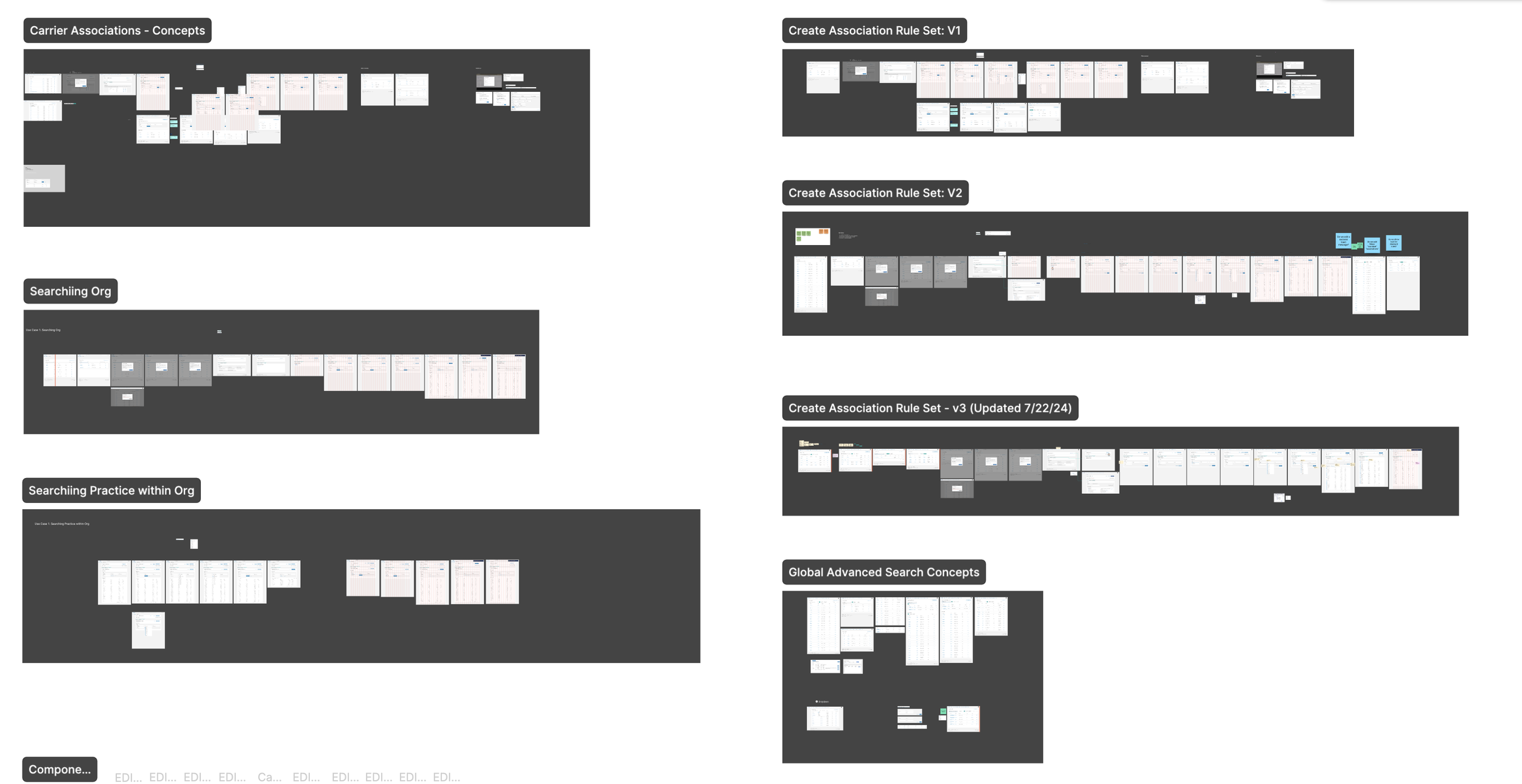
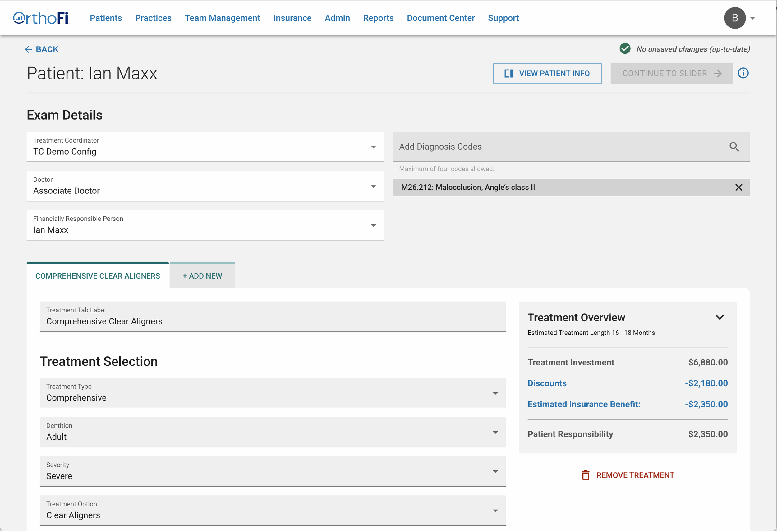
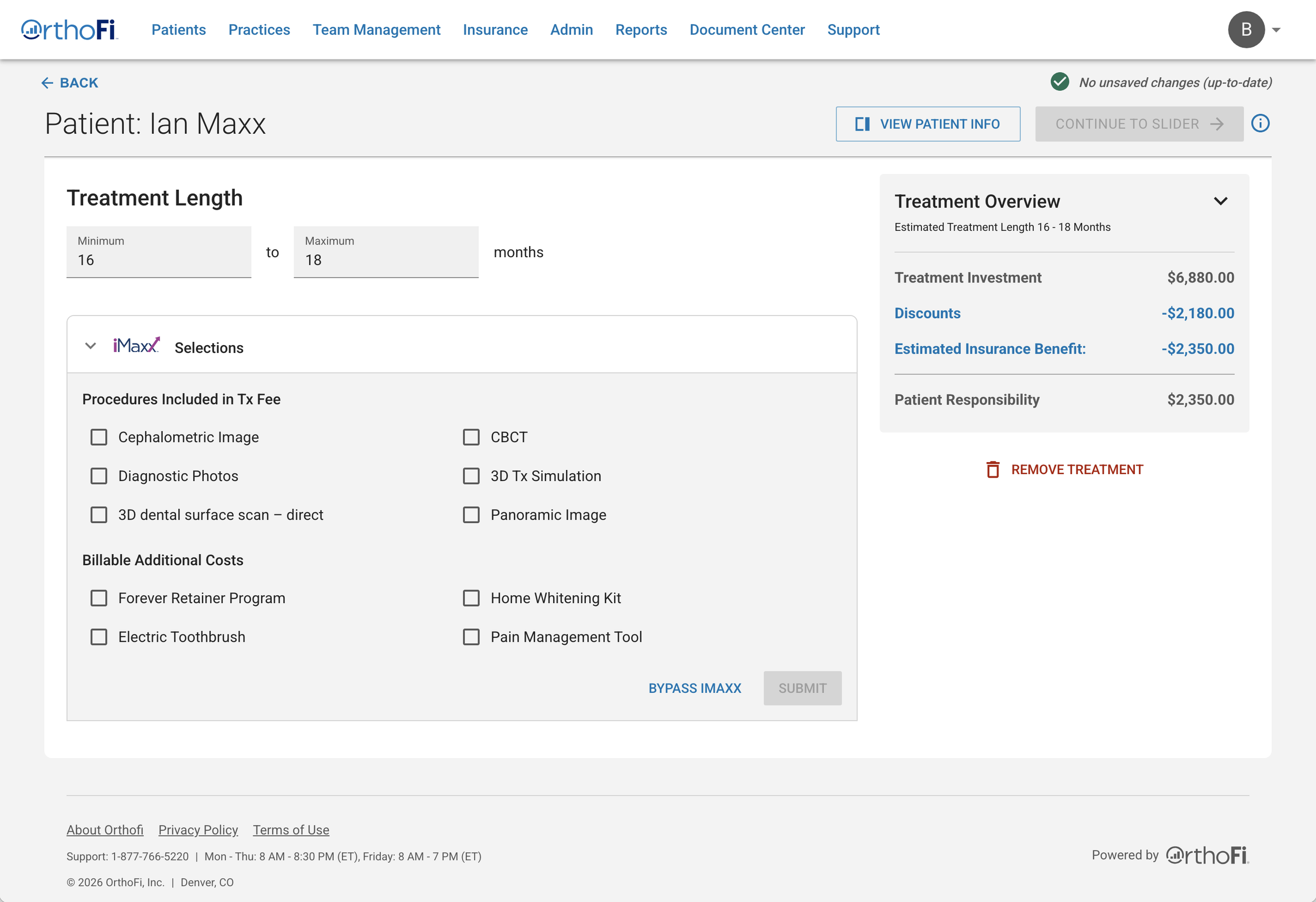
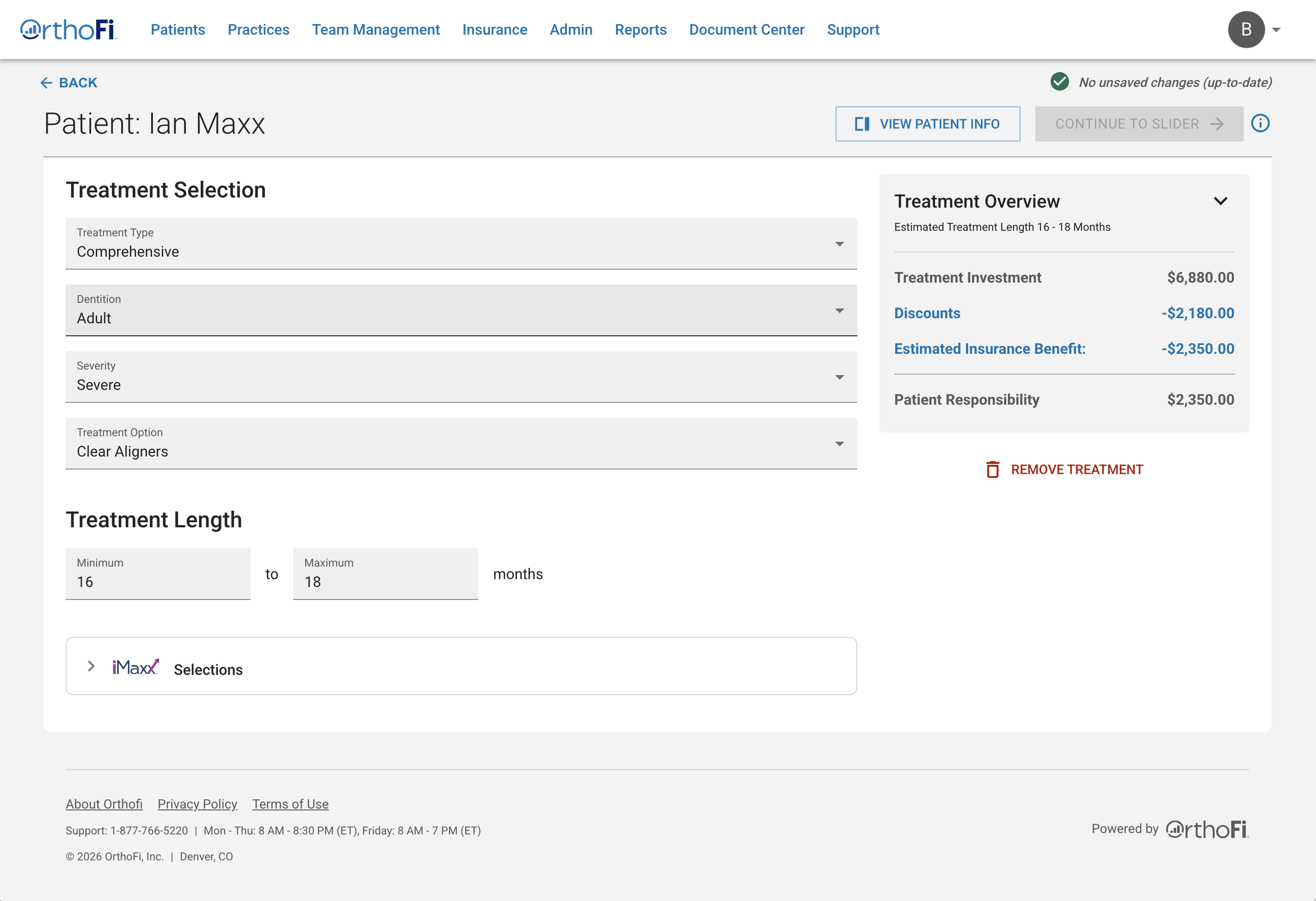
Phase 2: Treatment Coordinator Workflow
With a robust configuration system in place, we could now redesign the TC experience, where speed, confidence, and clarity were paramount.
The original UI felt interruptive and disconnected, appearing as a separate modal with unclear guidance. We reimagined the workflow as an integrated, contextual experience that supported TCs without slowing them down:
Inline collapsible cards presenting codes only when relevant
Contextual tooltips replacing intrusive banners, providing light-touch guidance
A real-time summary panel showing selected codes for immediate feedback
Grouping and prioritization of the most common codes to reduce effort and cognitive load
Persistent selections allowing users to edit without losing progress

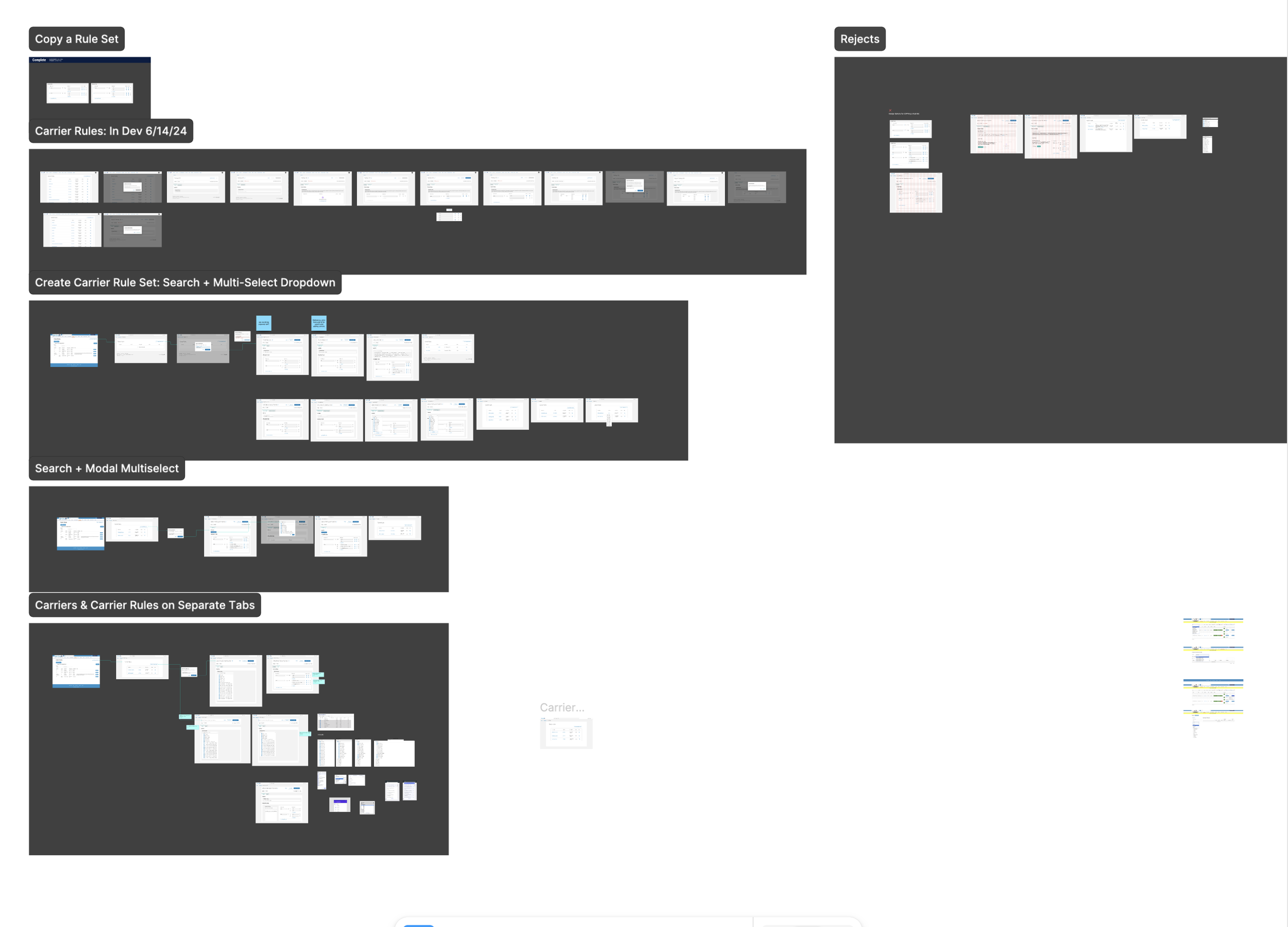
Iteration & Validation
With the workflow principles defined, we explored multiple layout directions to test clarity, speed, and cognitive load.
Early concepts varied in:
Placement of the summary panel (right rail vs. bottom dock)
Code grouping (alphabetical vs. frequency-based vs. rule-driven)
Badge hierarchy for urgency states (e.g., Pending Acceptance prominence)
Inline guidance density (tooltips vs. helper text vs. banners)
Through usability sessions with Treatment Coordinators and internal stakeholders, we identified a few critical insights:
TCs needed persistent visibility into selected codes while navigating
High-frequency codes had to be immediately accessible
Urgency states (like Pending Acceptance) required stronger visual hierarchy
Interruptive UI slowed confidence during patient conversations
These learnings shaped the final direction.
Final Workflow Direction
Concluding thoughts
Redesigning the iMaxX platform gave me the opportunity to simplify complex workflows for internal teams and make insurance code management more scalable. Collaborating closely with engineers and stakeholders, I introduced UX patterns like drag-and-drop code ordering, reusable rulesets, and smart defaults—features that saved teams significant time and reduced manual entry.
This project deepened my understanding of designing for enterprise scale, where clarity, consistency, and efficiency matter most. It also reinforced how impactful thoughtful UX can be when internal tools are treated with the same care as customer-facing products.