Resident Maintenance App
Redesigned request flows to reduce support calls, improve service accuracy, and rebuild trust with residents.
Role
Platform
Lead UX Architect
Company
SMS Assist / Invitation Homes
iOS & Android
Industry
Property Management
OVERVIEW
SMS Assist, a facilities management platform, partnered with Invitation Homes to redesign their resident maintenance request experience. I was brought in as Lead UX Architect to build a mobile-first app that would improve request clarity, reduce support calls, and increase resident trust.
-
Residents lacked a reliable and intuitive way to request maintenance digitally. Most avoided the outdated online portal, opting instead to call support—resulting in high call volumes, vague work orders, and frustrated users on both sides. The lack of clarity and visibility eroded trust and placed an unsustainable burden on internal teams.
-
We saw a clear opportunity to reduce call volume, improve request accuracy, and rebuild trust through a modern app experience. Research showed residents wanted a mobile-first solution that made maintenance feel simple, visual, and reassuring — without industry jargon or guesswork.
-
Decrease maintenance-related call volume
Improve request accuracy to reduce return visits
Increase app adoption and retention
Build resident trust through real-time transparency
Process
Research & Insights
To uncover root problems, I led a layered research approach combining market analysis, field research, and firsthand resident feedback.
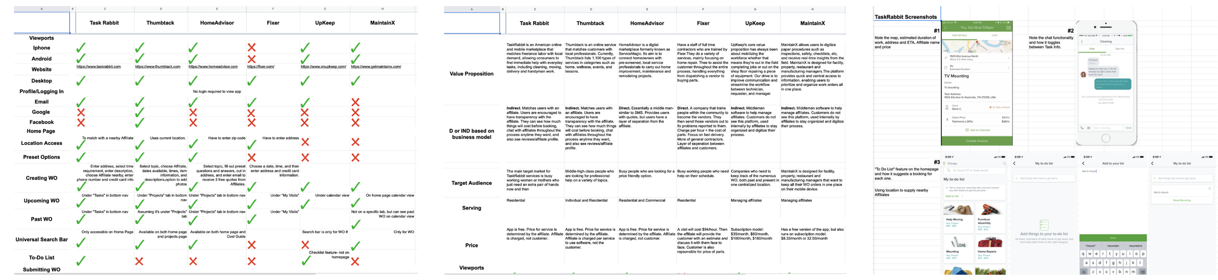
1. Competitive & Domain Analysis
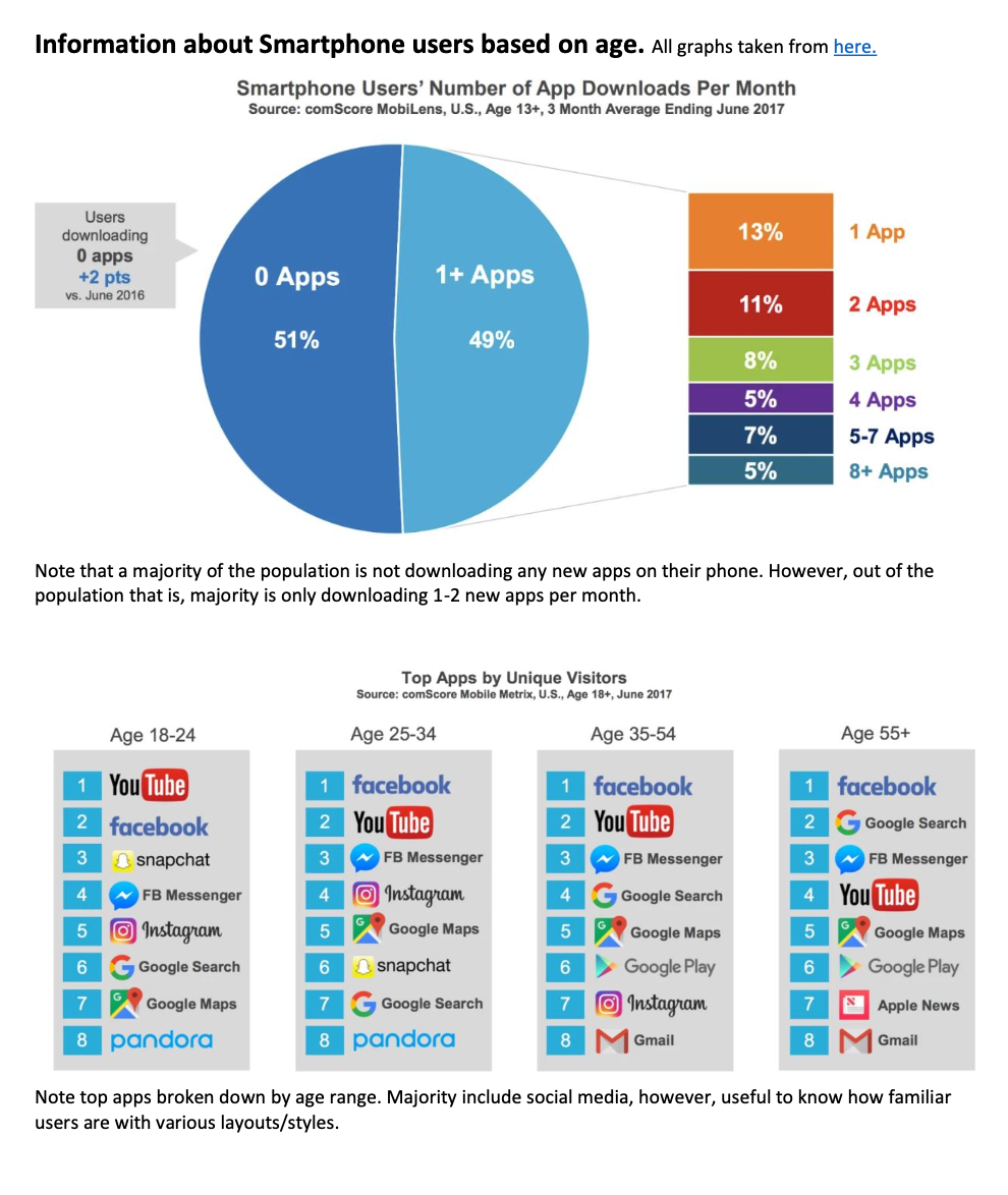
I audited six adjacent apps (e.g., TaskRabbit, Fixer, UpKeep), benchmarking common patterns, accessibility issues, and value propositions. From UI layouts to feature depth, the goal was to understand what made a guided service flow work—and what confused users. I also studied U.S. renter demographics to inform content tone and mobile behavior patterns.
2. Grassroots Discovery Sessions
In lieu of a formal research budget, I conducted 10 intercept-style interviews with renters across downtown Chicago. These 20–30 minute sessions explored past maintenance frustrations, preferred communication styles, and levels of tech familiarity. This approach revealed key behaviors while capturing the emotional undertone of trust, urgency, and confusion.
3. Quantitative Survey
To validate qualitative themes, I launched an 11-question survey through rental-focused Facebook groups and Reddit threads. With over 100 responses, we confirmed the following:
Users strongly preferred mobile over desktop for reporting
Many struggled with maintenance terminology
Most wanted status visibility and a way to express context (images, notes)
4. Affinity Mapping
I synthesized findings across all methods into an affinity map—grouping patterns around trust, clarity, effort, and escalation. These groupings directly shaped our prioritization of guided flows, visual cues, and transparent updates.

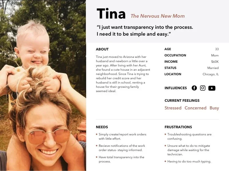
5. Persona
From this, we shaped our primary user: Tina, a nervous new mom—a time-strapped, tech-savvy renter who needed transparency and simplicity during home disruptions.
After research, I transitioned into synthesis and early ideation. Using our affinity map, I clustered insights around four key opportunity areas: communication clarity, guidance, emotional reassurance, and accessibility. These informed brainstorming workshops with our internal product and engineering teams.
Wireframes were built around three distinct interaction models, each reflecting different stakeholder assumptions and user needs. Each concept was rapidly prototyped, tested, and iterated on.
Wireframes & Iteration
I developed wireframes exploring three distinct interaction models—each rooted in different design hypotheses. Through multiple rounds of testing and refinement, we observed how users responded to guided flows versus open input models.
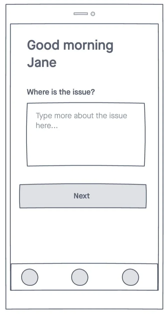
Concept 1 – Freeform Input: Allowed users to type their issue in an open field. Stakeholders initially preferred this model, believing it would empower user freedom. However, user testing revealed this added friction and increased ambiguity.
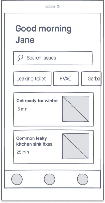
Concept 2 – Quick Links + DIY Support: Introduced a searchable interface and DIY content modules. While users appreciated the quick access, this model struggled when issues didn’t fit the predefined categories.
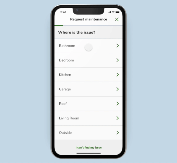
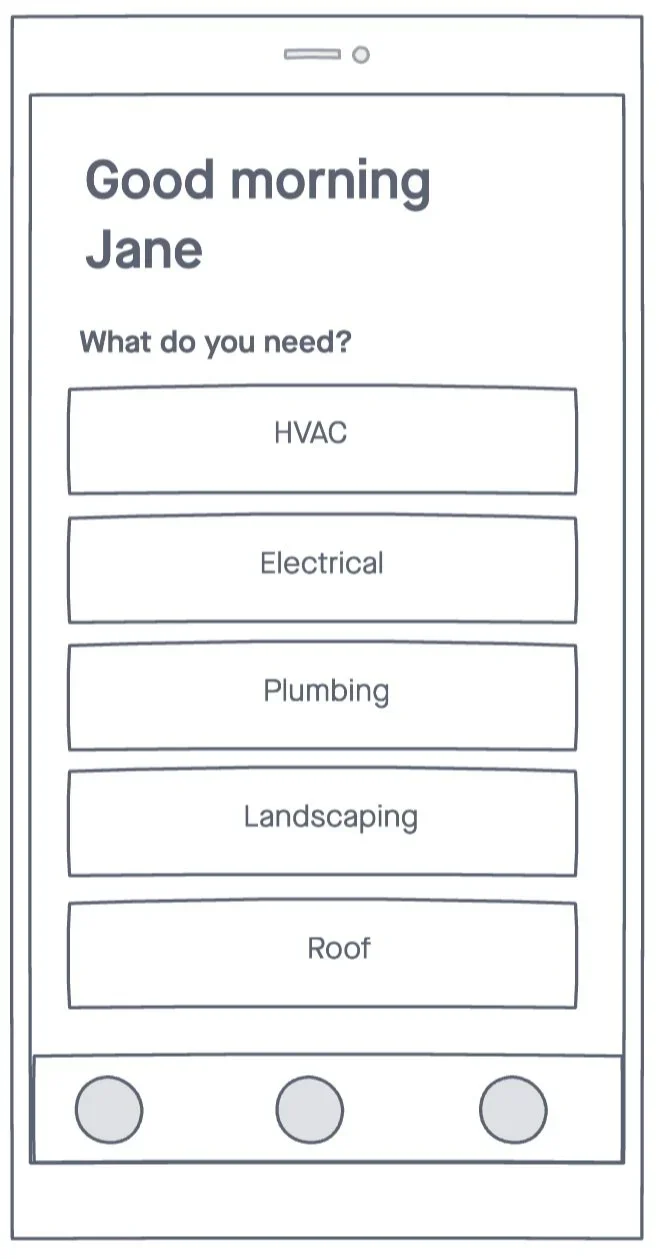
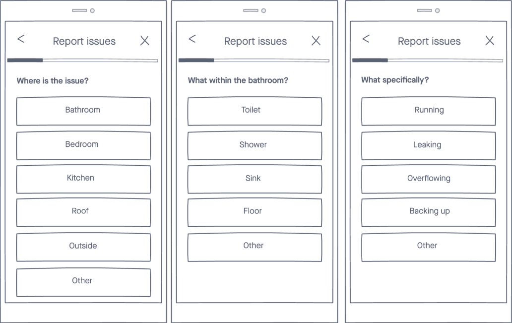
Concept 3 – Guided Category Flow (Final): Users selected the room, object, and symptom from a visual list. This model delivered the most success, especially when paired with icons, photo upload, and a progress bar. It required less effort and boosted submission accuracy.
Our final direction synthesized what worked from each iteration—structured flows, visual aids, and user-friendly copy—and eliminated complexity that led to drop-off or confusion.
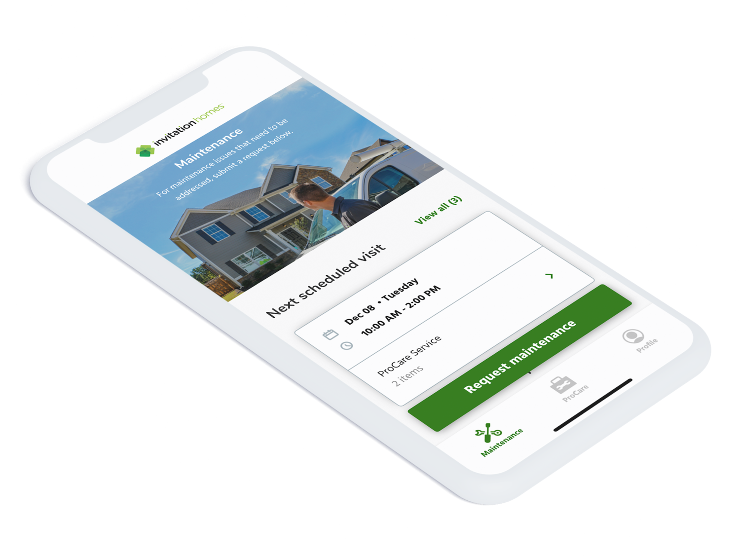
Final Design
The app experience included:
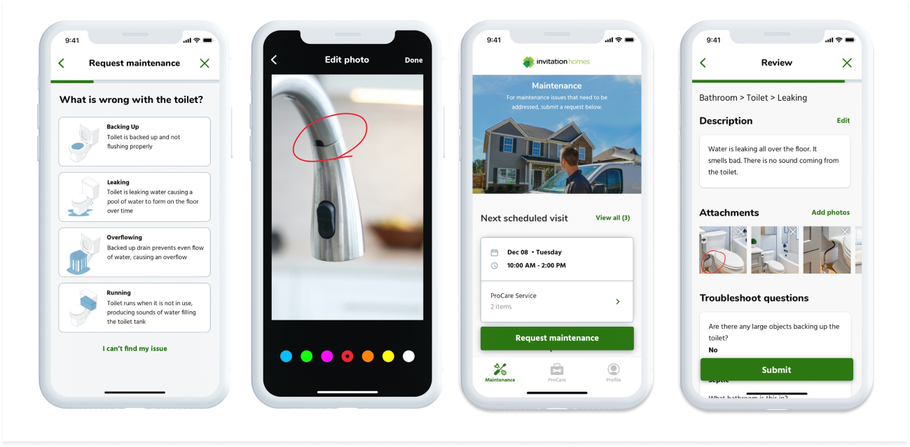
Guided issue selection with illustrations
Confirmation screens showing submitted details
Technician cards with ETA and job info
Progress bar showing past and upcoming steps
Fully accessible UI, WCAG-compliant color and type systems
We explored and tested three major interface concepts that reflected competing approaches to request entry—ranging from open-ended flexibility to structured, guided flows:


Outcomes
40% of all work orders were submitted through the mobile app within 6 months of launch (up from just 8%)
Support call volume for work order status dropped by 27%
Repeat service visits declined due to better request clarity and icon-based input
User testing showed a 100% success rate identifying issues via icons
Resident satisfaction scores improved based on app feedback