YouMe
Designing a trusted, teen‑friendly sex ed app for a mission‑driven client

Role
Year
PRODUCT DESIGN
2025
OVERVIEW
YouMe is an inclusive sexual education app for teens and young adults, offering gamified, age-appropriate learning modules.
As Consulting Product Designer at Florida Digital Center, I led UX strategy and UI design to bring this early-stage concept to life. I focused on creating a scalable, trustworthy learning experience while advising on product decisions to support engagement, growth, and revenue.
-
Teens and parents often lack access to trustworthy, age-appropriate sexual education resources. Existing platforms were either too clinical or lacked the interactivity needed to keep young audiences engaged. Our client wanted to break that barrier with a gamified mobile experience that could inform without overwhelming.
-
We had the opportunity to rethink how sex education could be delivered to a digital-native audience without losing credibility or sensitivity. This meant redesigning the information architecture, flow, and UI to support flexible learning styles, reduce friction, and make complex topics feel approachable. I also saw space to position the product for long-term growth by ensuring the design system could scale with future modules, monetization features, and partnerships.
-
Our UX goals were to create an experience that felt intuitive, inclusive, and rewarding. We needed to support different learning preferences (visual, textual, interactive), make progress feel engaging through gamification, and build trust with both teens and their parents. The UI also had to balance bright, inviting visuals with a tone of credibility and care, and for a topic that often carries stigma or discomfort.


Process
Audience Research
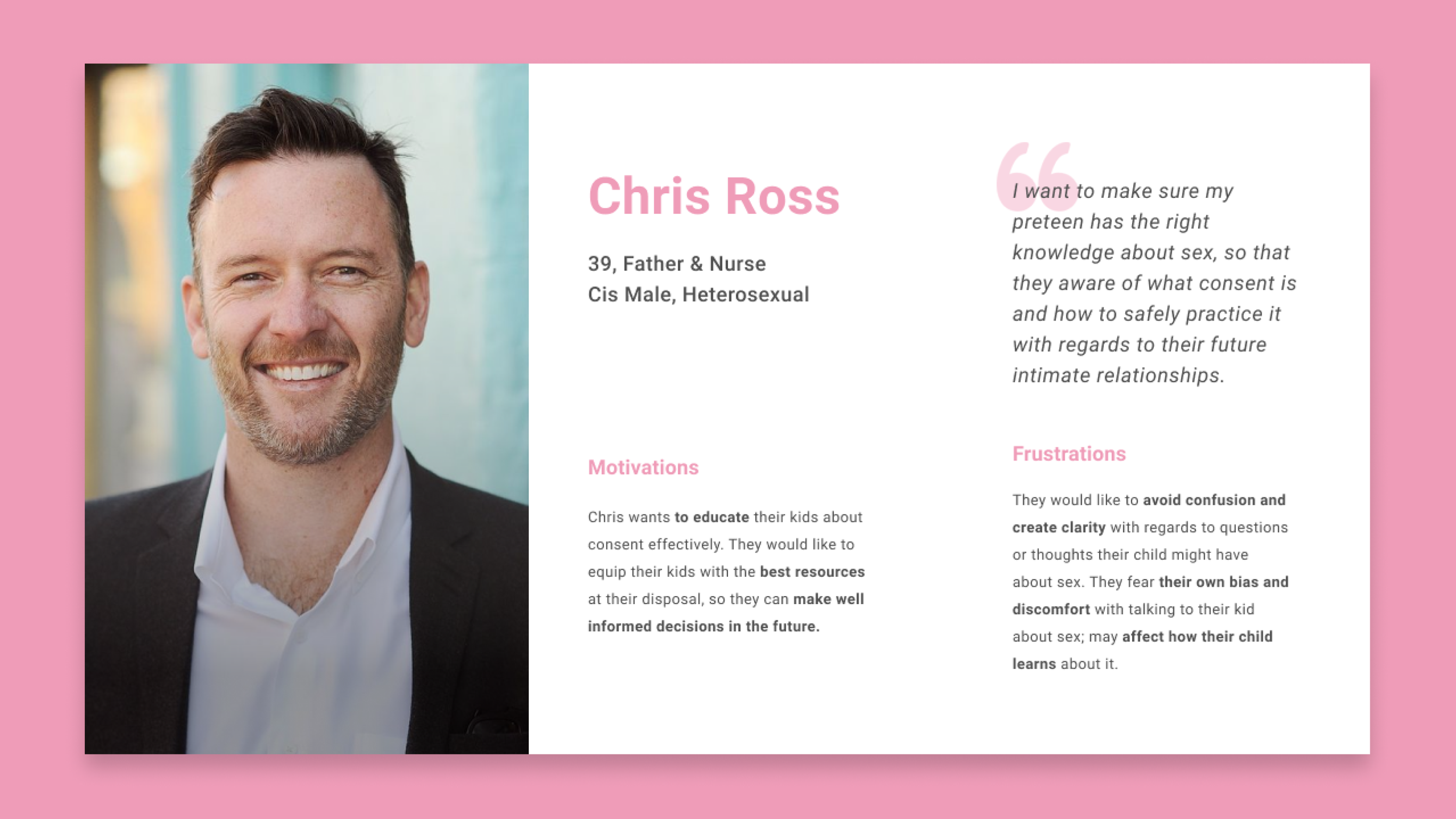
Our initial exploratory research uncovered that our target audience was teenagers, particularly those identifying within the LGBTQ+ community. We developed two primary personas:
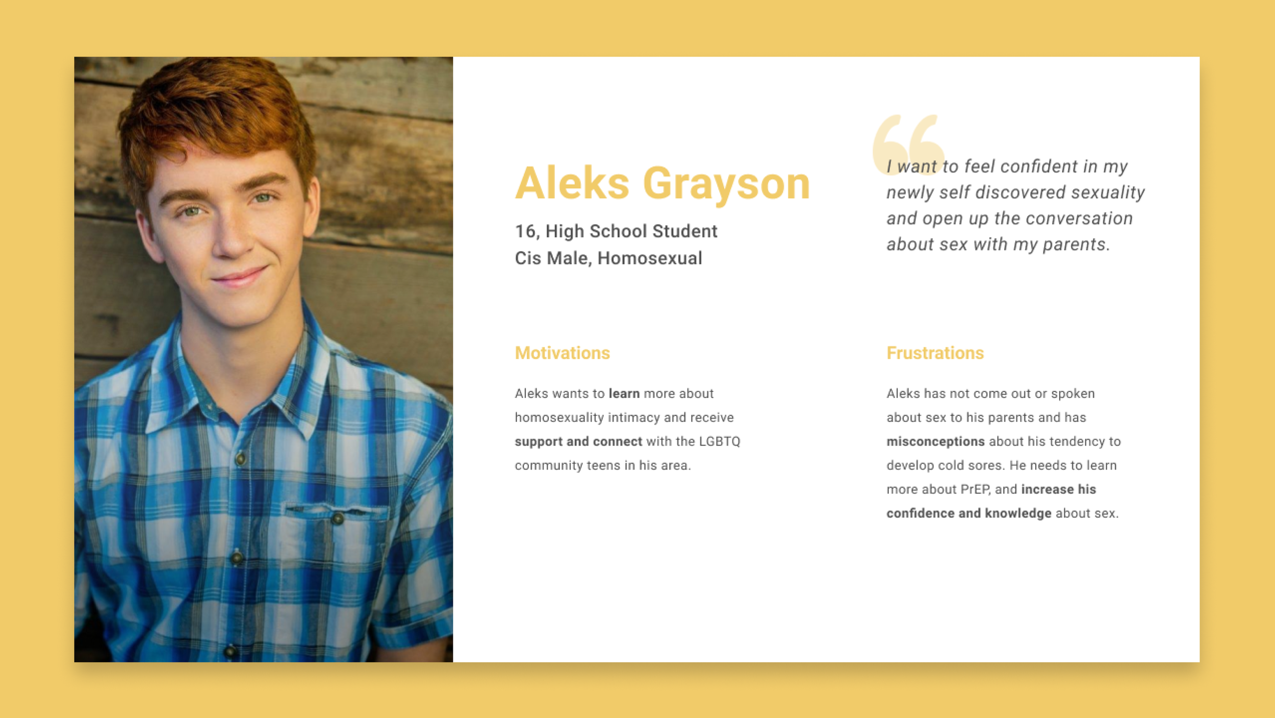
Aleks (16, high school student, LGBTQ+) — Seeks a safe and private space to learn.
Chris (39, parent & nurse) — Wants trusted content to support conversations at home.
These personas helped guide feature prioritization and tone of voice for both teens and adult users.
Journey Mapping
I created detailed journey maps for both personas, exploring:
Entry points into the app
Key emotional touchpoints
What users needed to feel understood, safe, and encouraged

Whiteboard Flows & Wireframes
I facilitated working sessions to map out content hierarchy, feedback loops, and screen flow across modules. Then I created mid- to high-fidelity wireframes in Figma, emphasizing:
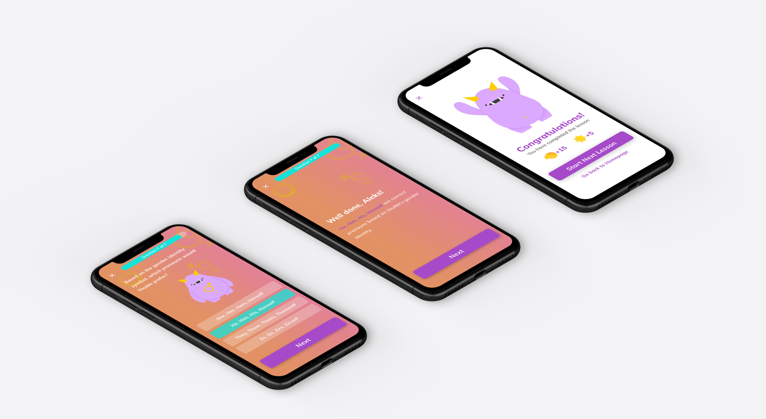
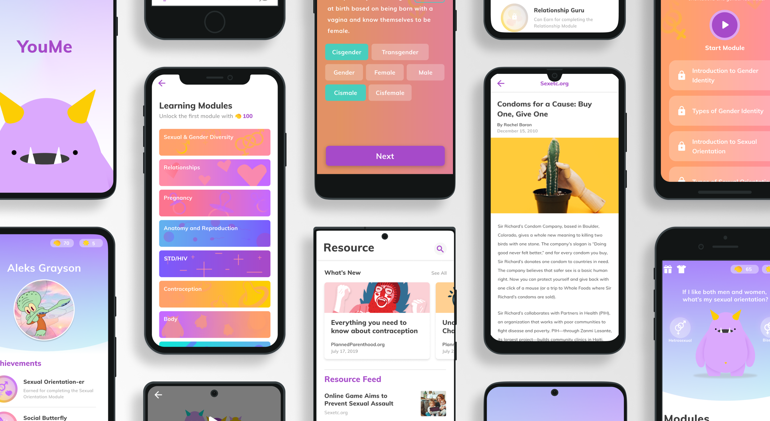
Gamified reinforcement (badges, avatars)
Progress tracking and quiz scaffolding
Clear CTA hierarchy and supportive copy


Usability Testing
We conducted moderated testing with 8 participants, including teens and parents, to validate core interactions and emotional tone. Participants completed tasks such as onboarding, completing a module, and exploring the reward system.
From this, we learned:
Users needed clearer quiz feedback and tone
Navigation was occasionally ambiguous
The purpose of rewards wasn't always obvious
We responded by:
Refining copy and UI elements for clarity
Adding tooltips and progress indicators
Reworking reward visuals to feel more purposeful and motivating
Final Outcome
The final prototype included:
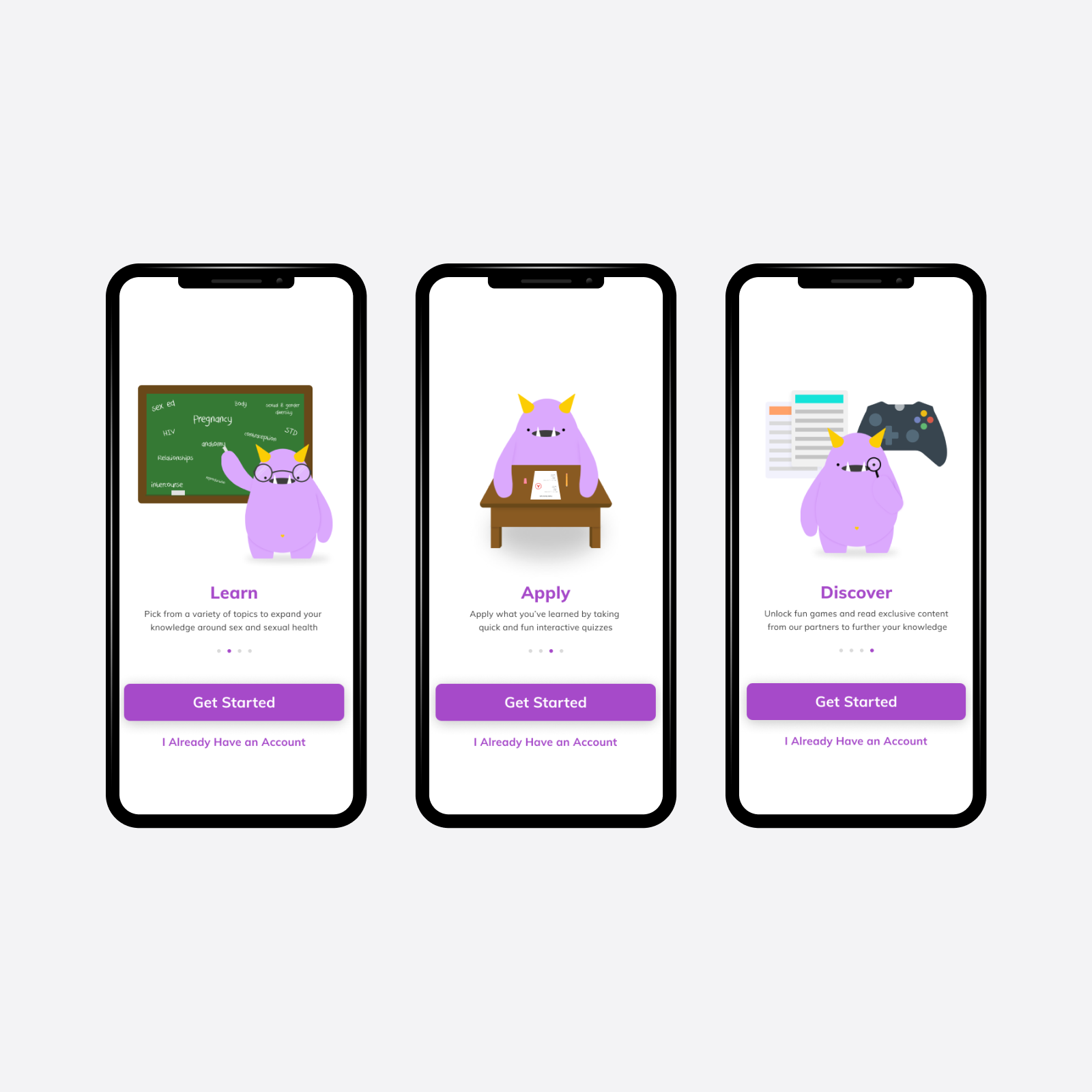
A modular structure: Explore, Learn, and Discover
Gamified UX that didn’t overshadow content (e.g., avatar customization, achievement badges)
Personalization elements to support different user types and topics