OrthoFi BI
Redesigning data workflows for internal teams

Role
UX/UI DESIGN
Tools
FIGMA
OVERVIEW
OrthoFi is a healthcare SaaS platform that supports orthodontic practices with insurance, billing, and patient onboarding. When the company transitioned from Tableau to Power BI, the internal BI dashboards needed a complete redesign.
Three high-impact dashboards used by account teams which tracking insurance aging, claims, and overall financial health, were visually dense, inconsistent, and difficult to act on. This redesign aimed to improve clarity, efficiency, and usability for real workflows.
-
The legacy dashboards were cluttered, inconsistent, and difficult to navigate. Key performance indicators were buried. Filters behaved unpredictably. Visual hierarchy was lacking, which slowed down daily workflows and complicated onboarding.
-
Redesigning these tools presented a clear opportunity to streamline financial workflows, improve visibility into key performance indicators, and introduce scalable patterns for how OrthoFi presents operational data across the company.
-
Simplify the layout for faster insight.
Surface the most critical KPIs upfront.
Create consistency across all dashboards.
Support account teams in monthly performance reviews.
Establish scalable design standards within Power BI.
These goals helped frame and guide UX decisions at each stage of the project.
Process
With clear goals and context in place, we began the discovery process. Our research focused on understanding the needs and behaviors of the people who relied on these dashboards most.
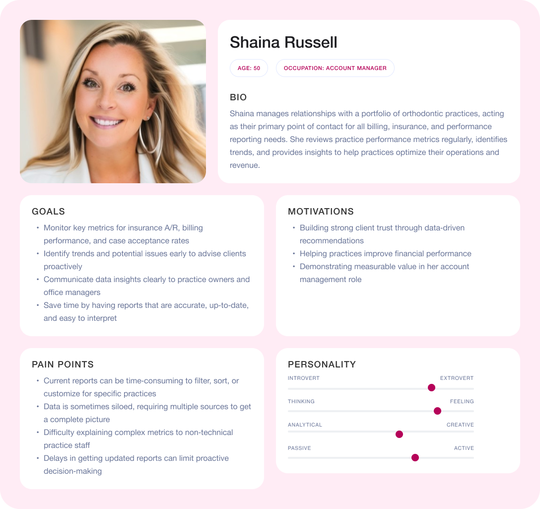
Audience
Account managers were the primary users of these dashboards. They often managed multiple client accounts with varying financial complexities. These users needed tools that could provide both quick snapshots and allow them to dig into detail as needed.
To better understand their workflows, we partnered with subject matter experts from the Account Management and Finance teams. Through this collaboration, we identified that many usability issues stemmed more from layout confusion than from problems with the data itself.
Research & Insights
To uncover specific pain points, we conducted rapid discovery interviews and usage audits. These efforts revealed several common themes:
Filters were inconsistent across dashboards.
Important metrics were missed due to weak visual hierarchy.
Users needed dashboards that could offer both quick performance snapshots and deeper analysis.
These insights confirmed the need for cleaner information architecture and informed our early design hypotheses. I also gathered some reference ideas before diving into wireframe concepts.
Wireframes and Flows
We mapped core user flows and sketched modular wireframes in Figma to test layout strategies. Key decisions during this phase included:
Adding persistent KPI bars for high-signal data.
Grouping charts by task or metric type.
Simplifying filters with common preset options.
These foundational flows helped de-risk design choices before moving into higher-fidelity work.
Bridging Discovery and Design
With user needs clarified and layout hypotheses tested, we shifted into design refinement. This stage focused on ensuring our layouts could support real-life workflows and deliver usable, high-impact dashboards.
Internal Feedback Loop
While another designer led the initial stakeholder reviews, I worked closely with them to refine layout and visual clarity based on internal feedback. I gathered insights from Account Managers and Finance stakeholders, who emphasized the following:
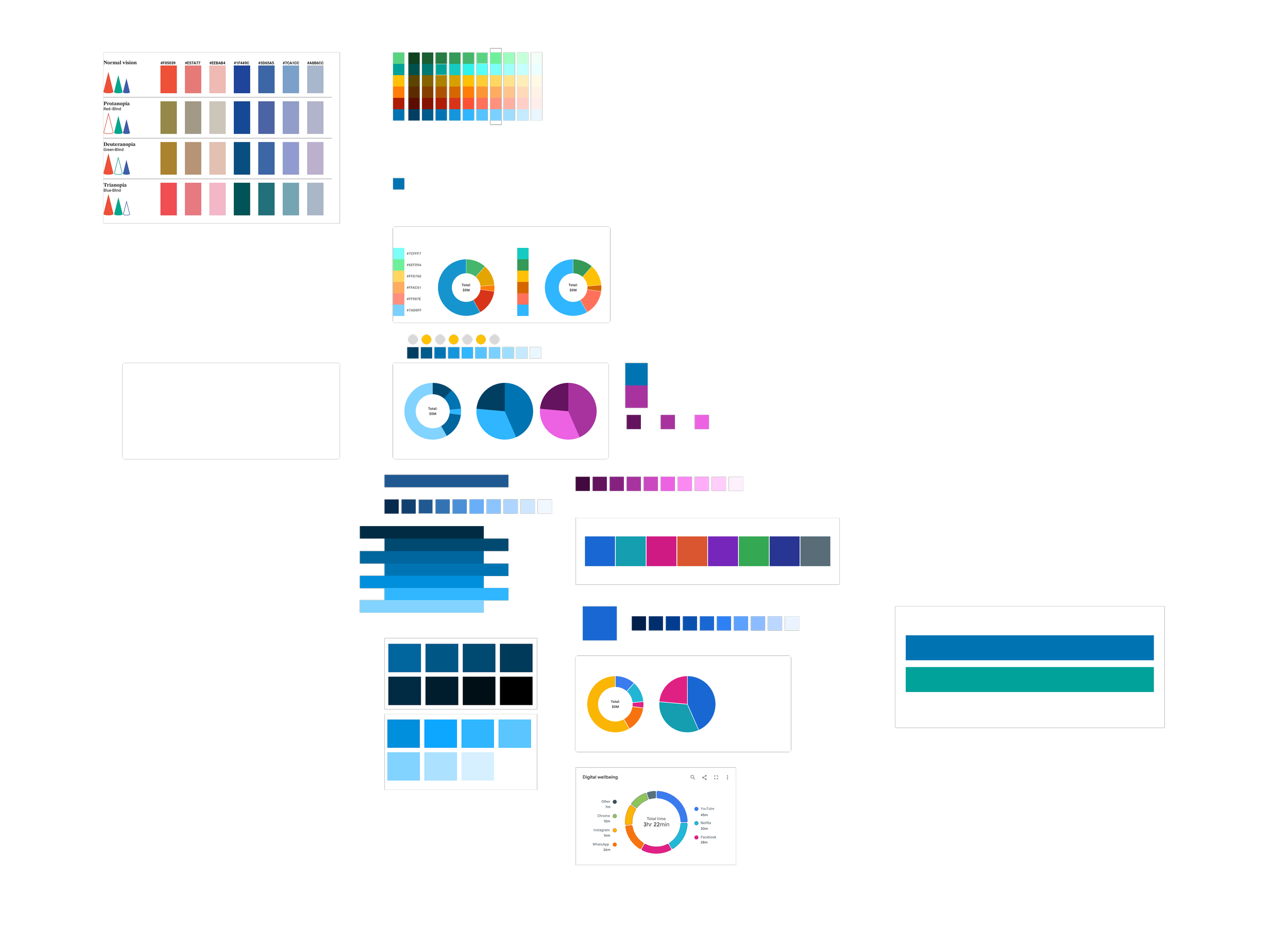
Clearer color contrast was needed in pie and line charts.
Sticky headers were desired to help track key metrics while scrolling.
Filters needed to be consistently placed and logically grouped.
I incorporated this feedback by adjusting the color systems for accessibility, improving spacing and table header behavior, and aligning filters across all reports. These updates made the dashboards faster to interpret and more effective during live client reviews.
Design Strategy
At this point, we transitioned into high-fidelity design and delivery. This phase was guided by a strategy tailored to the constraints of Power BI.
Design Constraints
Power BI’s layout engine presents unique limitations. It restricts control over spacing, component styles, and interactivity. Our challenge was to design dashboards that were scalable, readable, and intuitive, all while working within these rigid technical boundaries.
Design Principles
To ensure consistency and usability, we followed a focused set of design principles:
•Prioritize top KPIs for at-a-glance comprehension.
Use specific chart types for specific needs (e.g., line for trends, pie for breakdowns, tables for detailed review).
Group related metrics visually using spacing and labels.
Establish reusable layout patterns across all dashboards.
These principles helped create a design language that scaled across OrthoFi’s expanding Power BI suite.
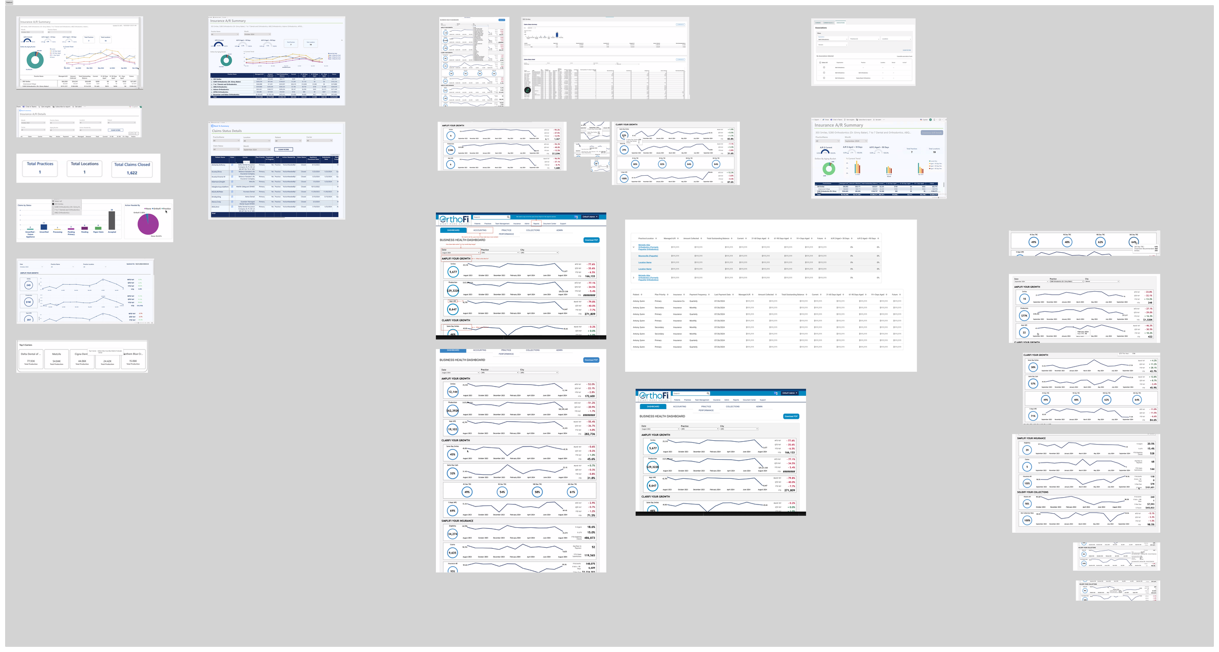
Dashboard Redesigns
We applied our design strategy across three high-impact dashboards. Each had its own set of UX challenges and opportunities.
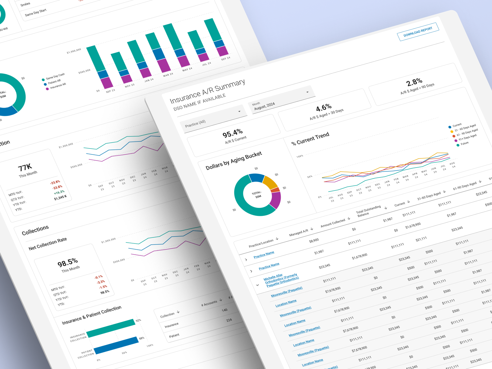
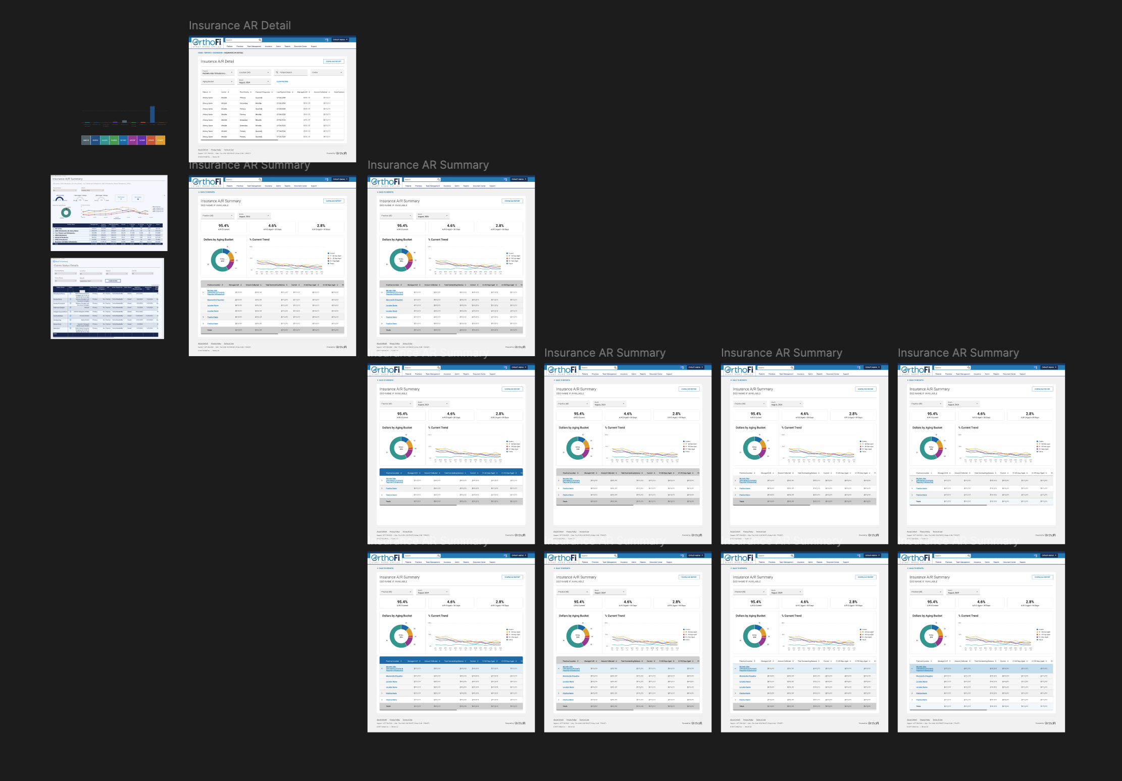
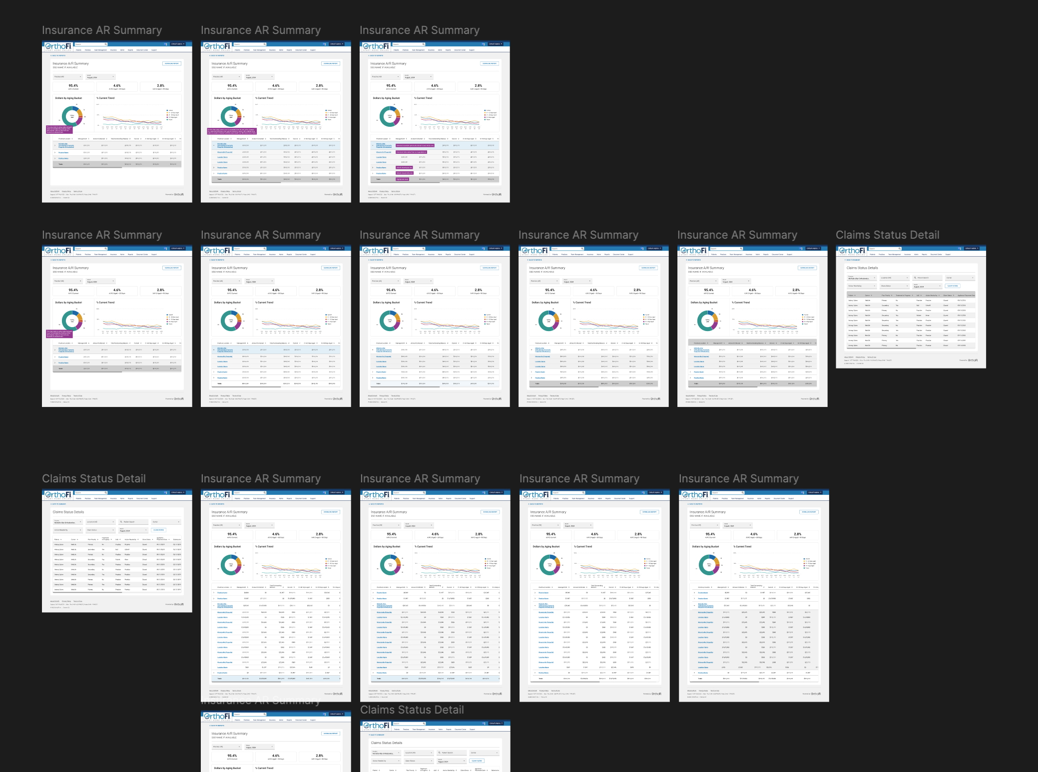
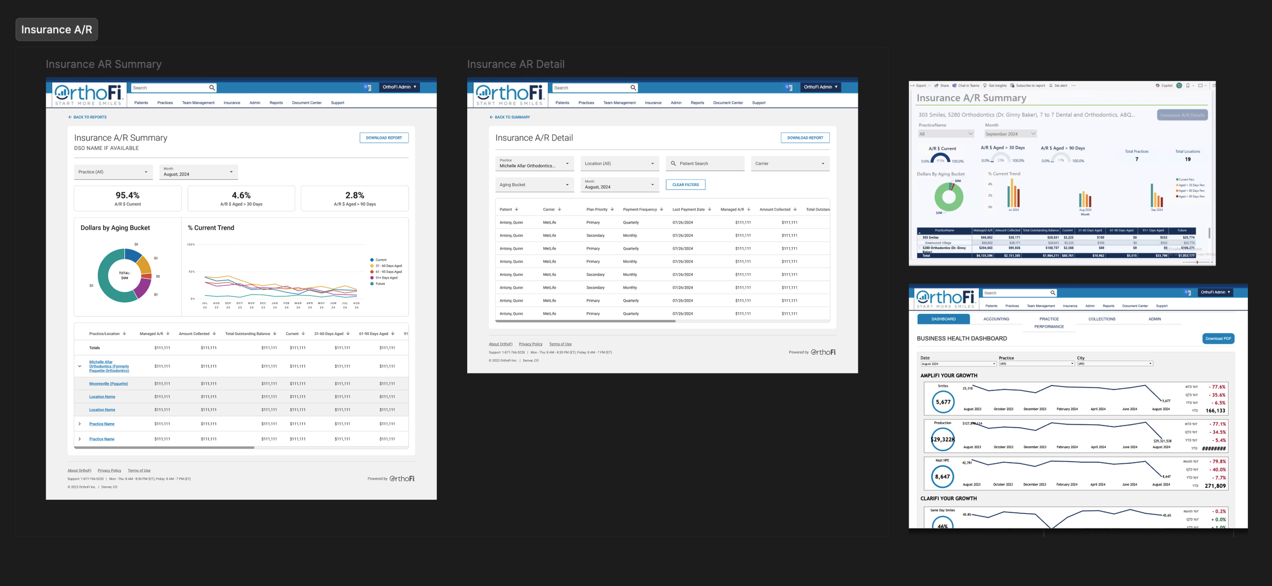
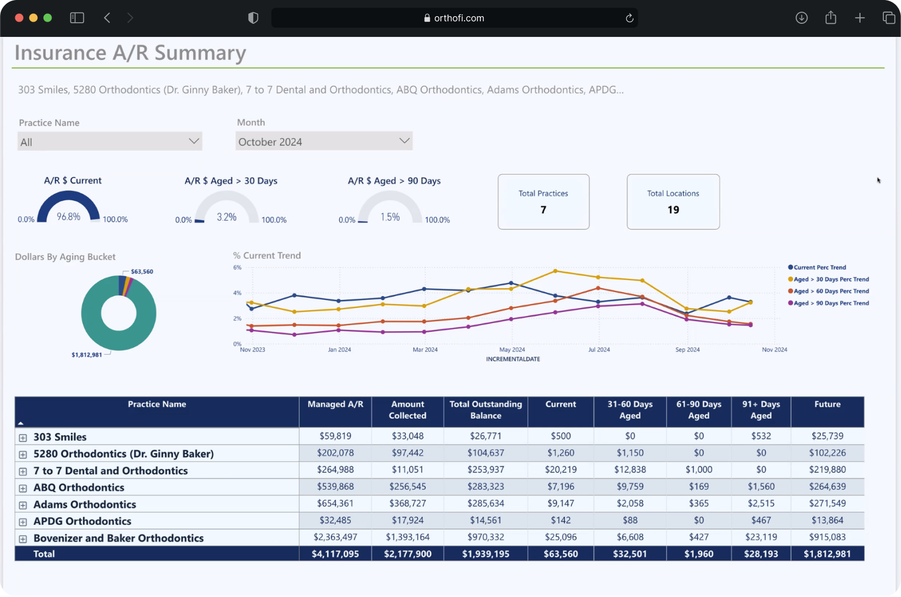
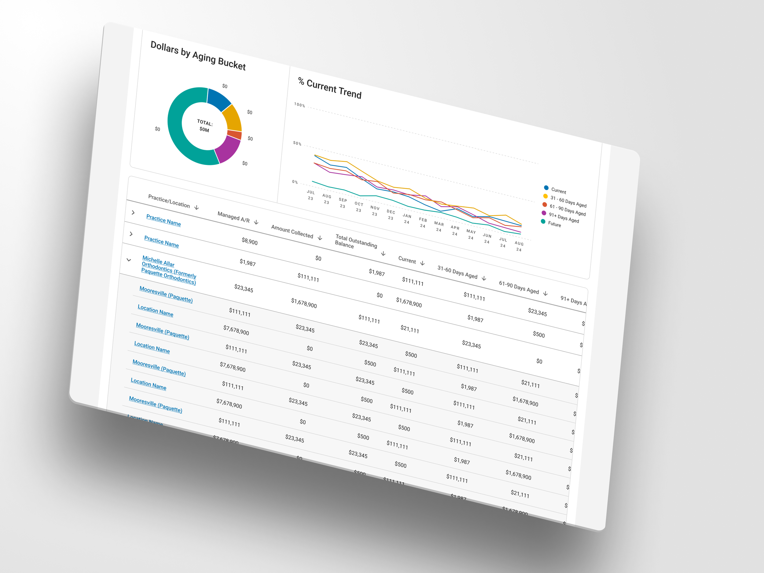
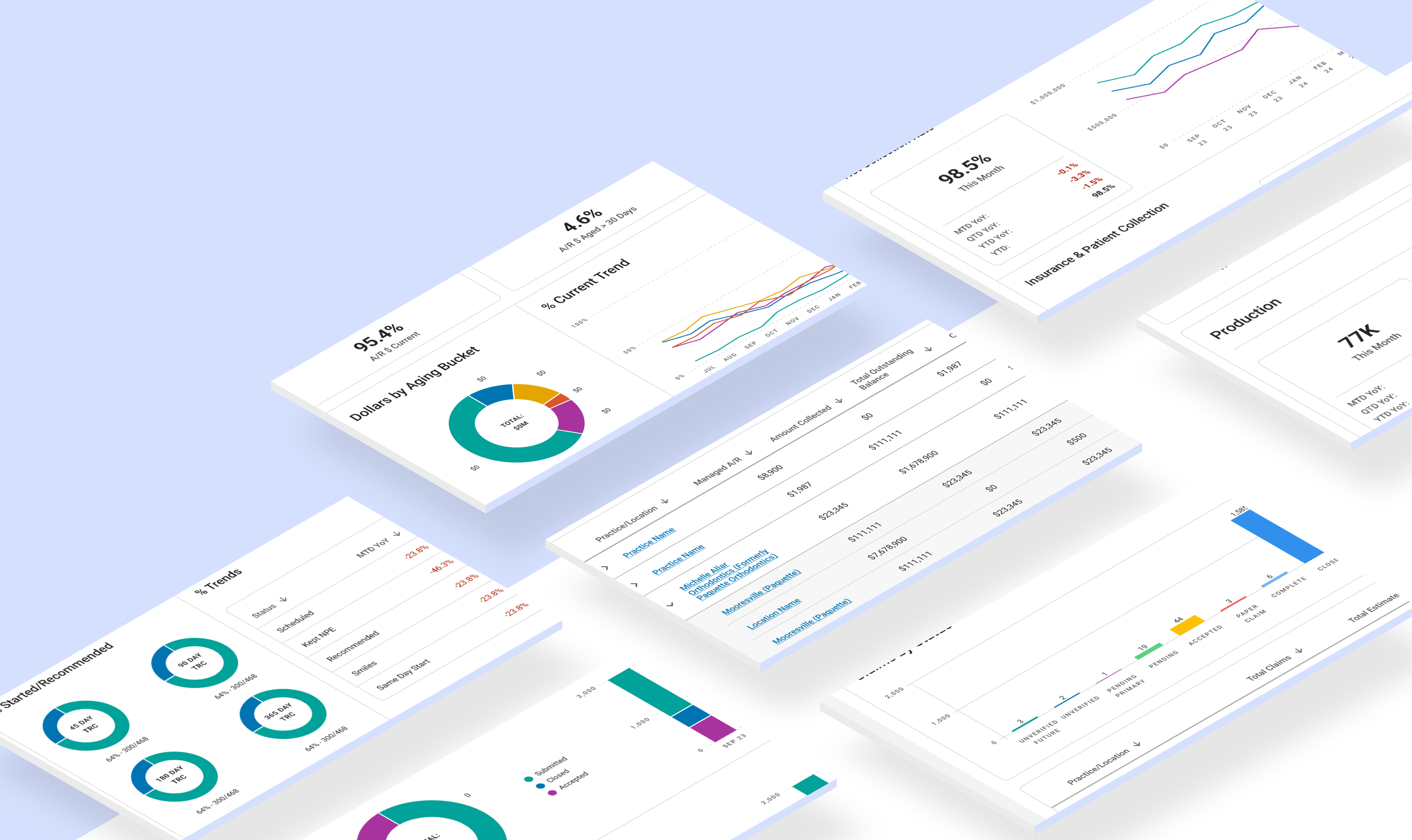
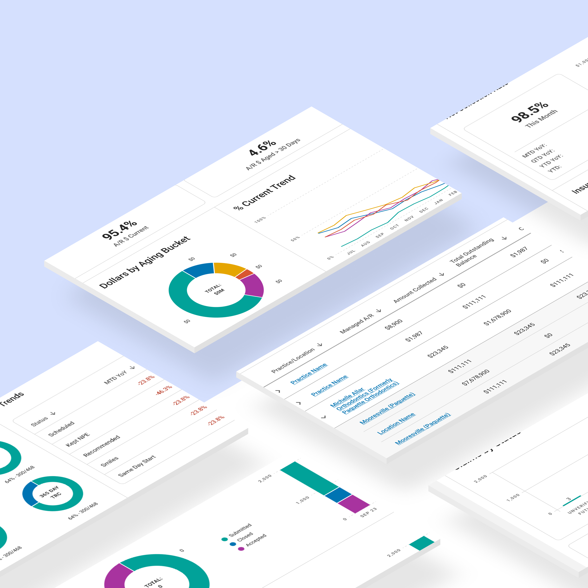
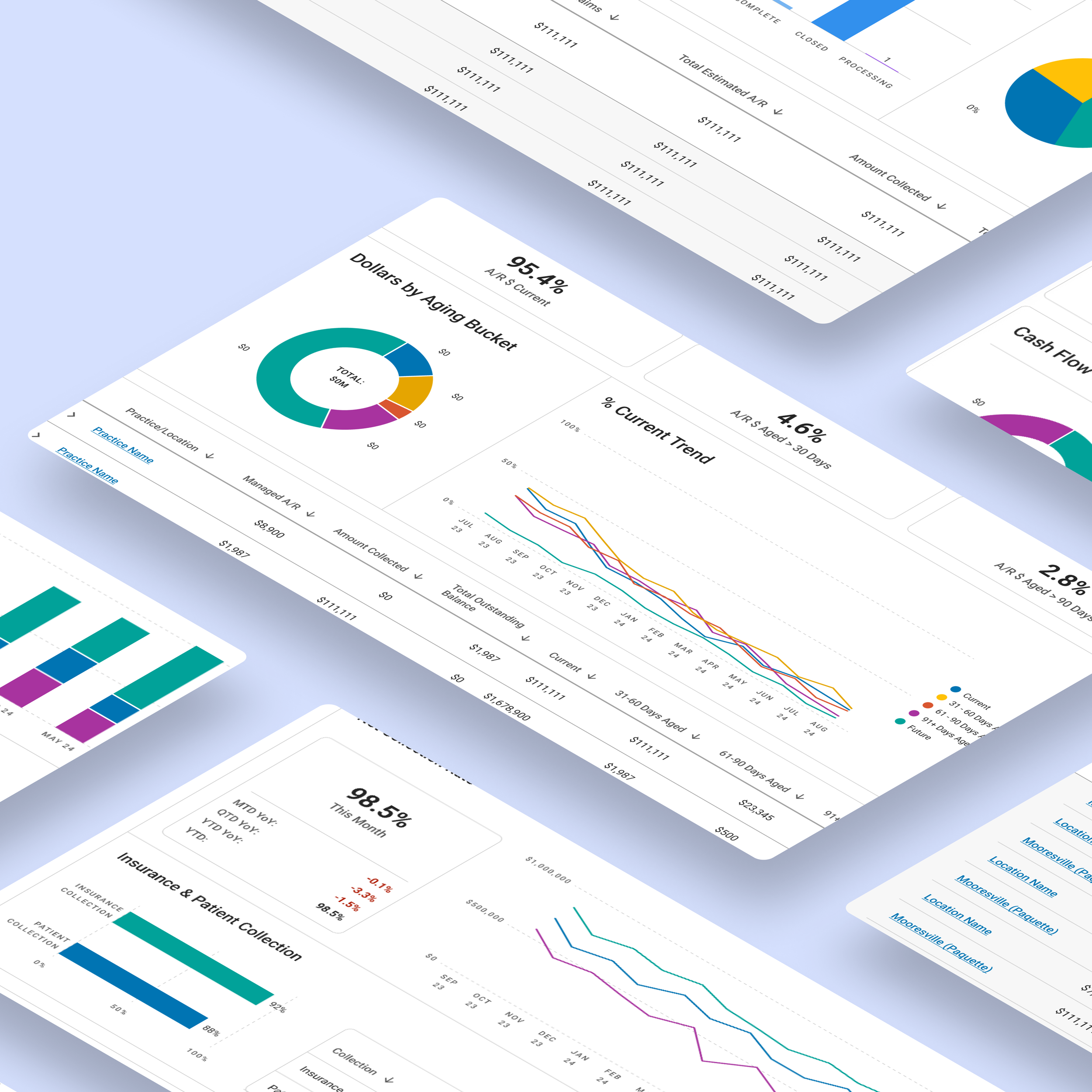
Insurance A/R Summary
Problem: Aging data was hard to interpret. Important KPIs were buried, and filter behavior was inconsistent.
Solution:
• Introduced a persistent KPI bar for quick scanning (Current %, >30, >90).
• Used pie charts to visualize dollar distribution by aging bucket.
• Added a trend line chart to show performance over time.
• Reordered the layout to follow a natural decision flow: filter, scan KPIs, and then dive into data.
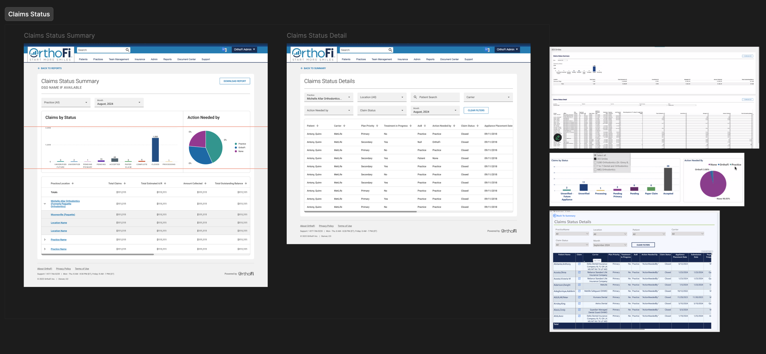
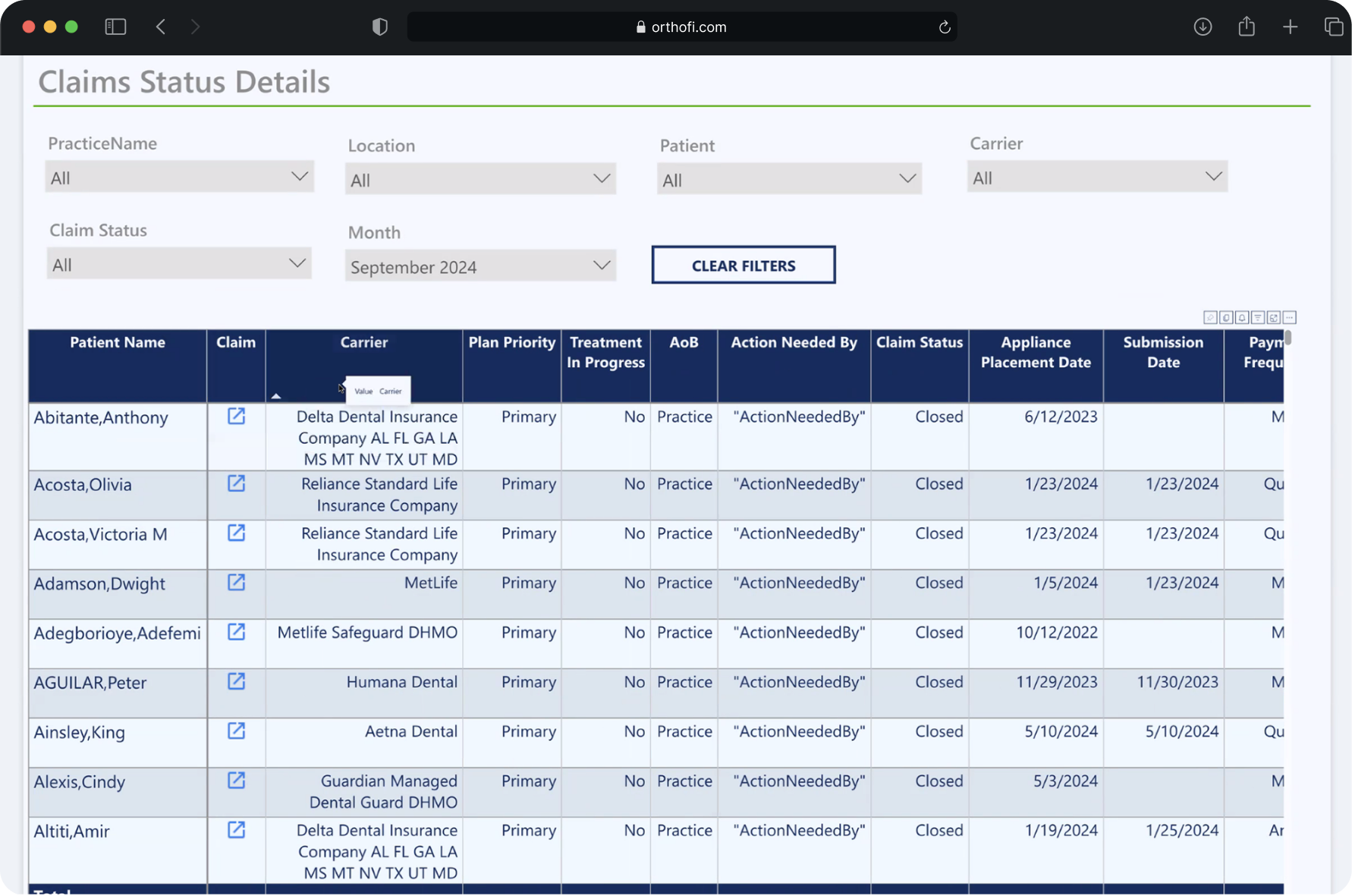
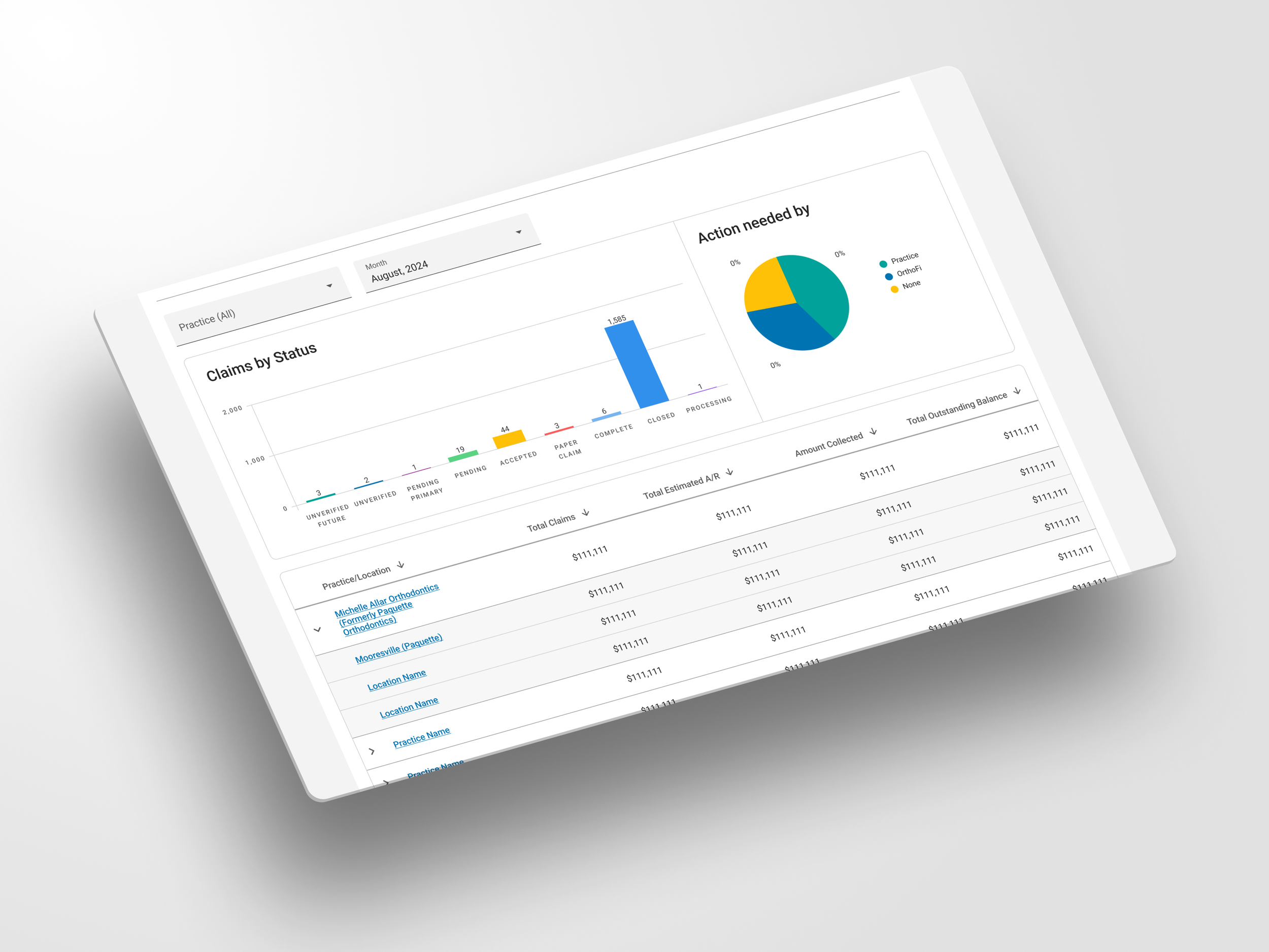
Claims Status Summary & Detail
Problem: Users had trouble identifying which claims needed action and who was responsible. Filters were confusing and unstructured.
Solution:
Simplified filter options by role and claim status
Added bar and pie charts to show claim statuses and ownership
Used sticky headers and sortable tables to support efficient review
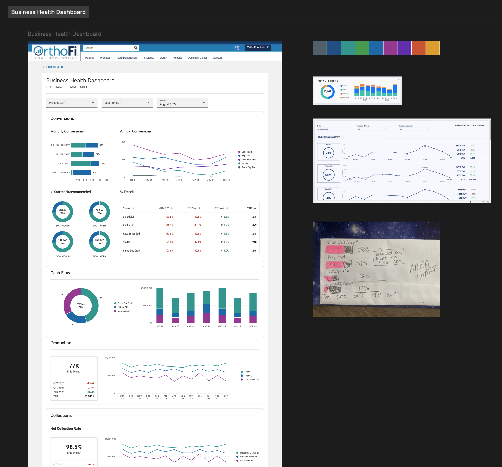
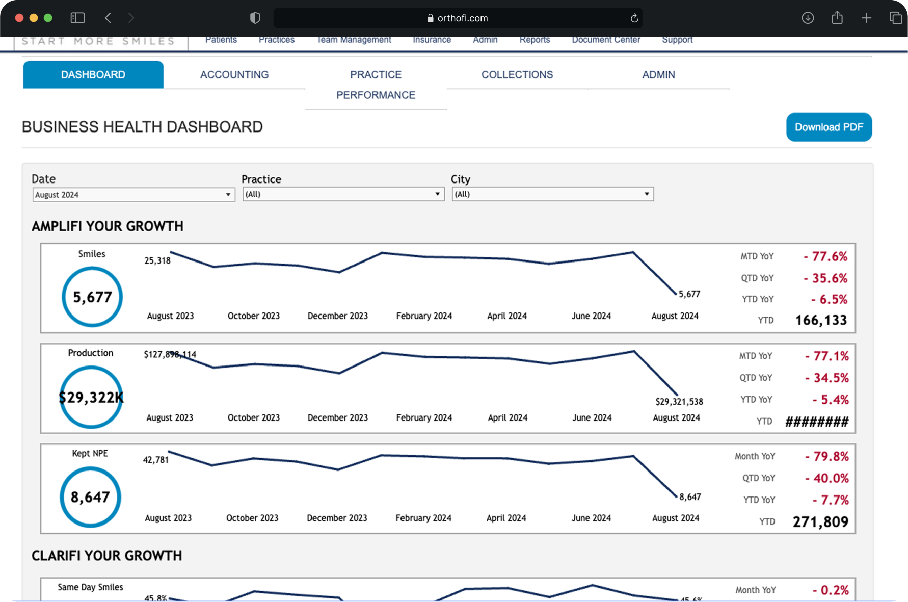
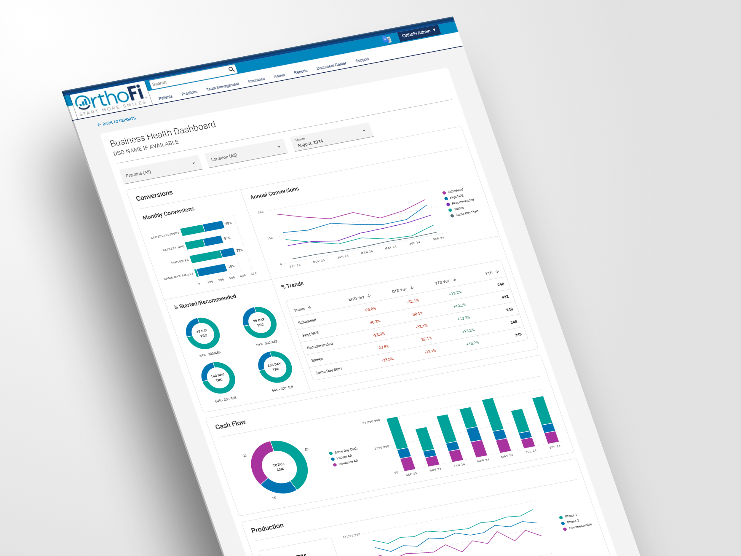
Business Health Dashboard
Problem: The dashboard was dense and lacked clear organization. This overwhelmed new users and made the experience less efficient for experienced ones.
Solution:
Grouped content by function: Conversions, Collections, Cash Flow, and Insurance
Applied consistent spacing, chart types, and KPI cards
Created modular sections to support progressive scanning and simplified onboarding
Results
The redesigned dashboards delivered measurable improvements:
Onboarding time was reduced due to simplified architecture
Monthly client review sessions became more actionable and time-efficient
The design patterns were reused across other Power BI reports
We influenced internal standards for how financial data is presented company-wide
Even when working within highly technical systems, thoughtful UX can elevate clarity and usability in meaningful ways.

Concluding thoughts
Redesigning OrthoFi’s BI dashboards gave me the opportunity to think systematically about how data visualization and layout impact real-world decision-making. While the platform constraints in Power BI were challenging, they also sharpened my ability to design within tight boundaries—something I now view as a strength, not a limitation.
This project reminded me that clarity doesn’t come from decoration, but from intentional structure, prioritization, and hierarchy. It also reinforced how small visual choices, like the placement of a filter, or the color of a chart, can significantly improve a user’s confidence in acting on data.
Since completing this work, I’ve continued growing in this space. I’m currently exploring Figma’s new AI-powered design tools and prototyping interactive dashboards to experiment with even more engaging and scalable reporting solutions.